00 Index
Everything about how Askvel looks, sounds and moves, and every file you need to use it.
FoundationsPart 1 of 3
ExpressionPart 2 of 3
ResourcesPart 3 of 3
Part 1 of 3
Foundations
Principles
Everything begins with a question.
Socrates never wrote a book; he simply kept asking until the answer walked out on its own. Askvel carries that craft forward: you ask once, and we walk the rest of the way in a single stroke.
Socratic
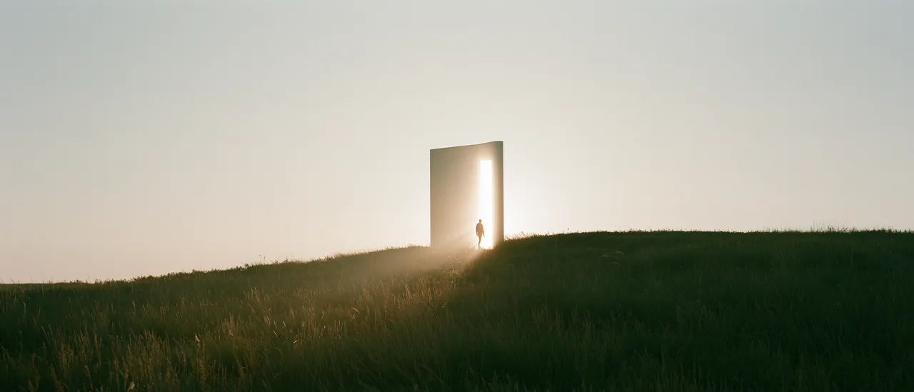
A question is a door.
We walk through with you and see how many rooms lie behind it.
Erudite
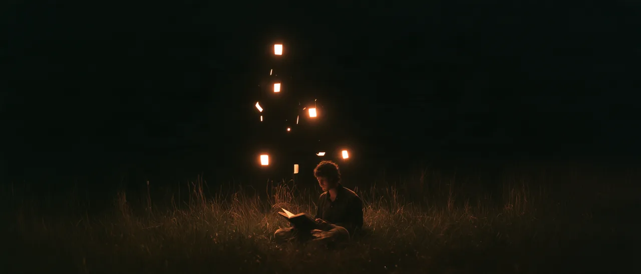
Pages give off light.
Centuries of thought have settled there; we turn the lamp toward you.
Fluent
Like a river.
A river never stops to explain itself. It bends around stones and arrives, calmly.
Quiet
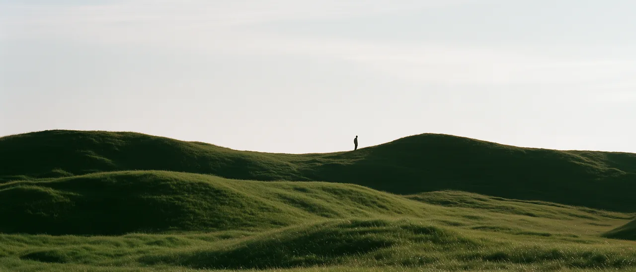
Leave most of the picture to the sky.
We leave space so your idea has somewhere to stand.
Human
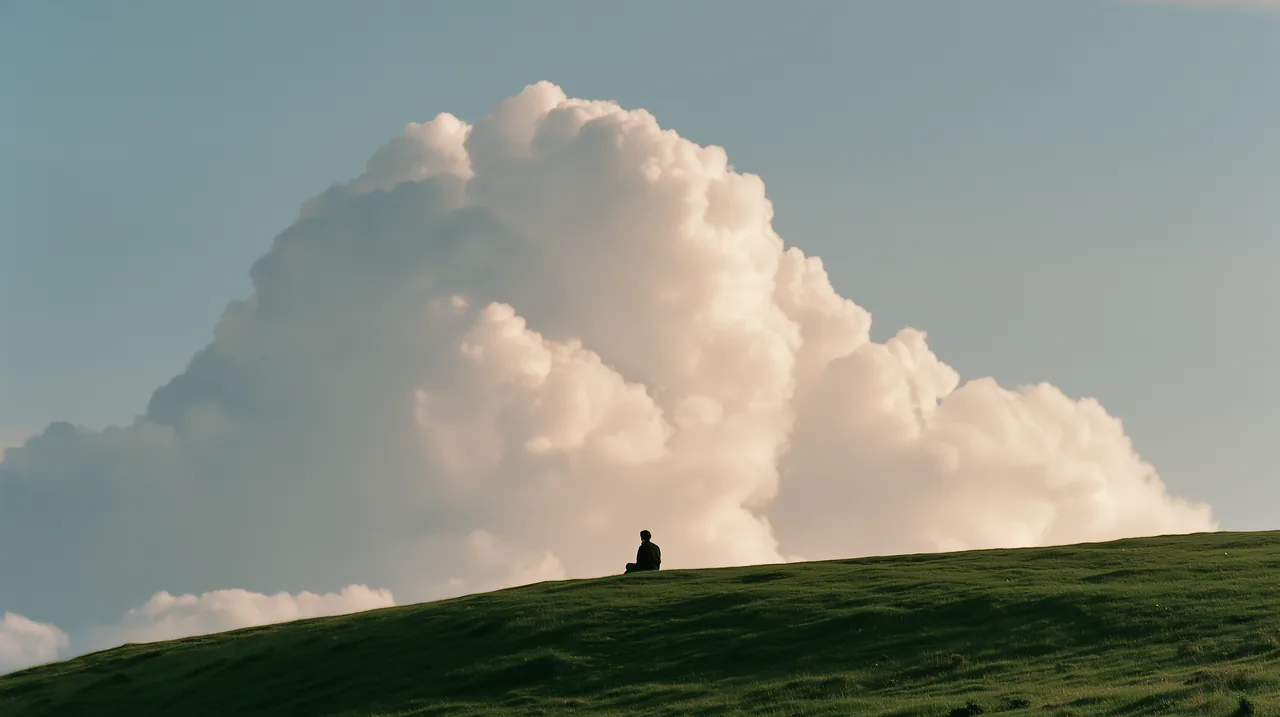
There is always a person in the picture.
You ask, and you are the one in the light.
Logo
The a is where the question begins; the arrow is where the answer goes. It is always one color and always this shape.
02.1
The mark
Use the mark alone where space is tight or the name is already present: app icons, favicons, avatars, the corner of a slide.
StrokeOne continuous stroke
MeaningOur mark is a lowercase a, the first letter of ask and of the alphabet. The wide arc catches the question; inside, the line turns back on itself once, which is the thinking; then the stroke becomes an arrow pointing up and to the right, sending the answer out the door. One stroke.
02.2
Wordmark
The horizontal lockup (mark plus the italic serif name) is the primary logo. Use it wherever Askvel is introduced for the first time.
02.3
Reversed
On dark surfaces the logo turns white. There is no grey, tinted or outlined version: the logo is either Ink on light or White on dark.
LightOn light · Ink #121212
DarkOn dark · White #ffffff
WebOn the website the logo inherits the text color, so switching the theme switches the logo automatically.
02.4
Clear space
Give the logo room. Keep text, other logos and the edge of the page out of the clear space.
Clear spaceThe clear space is x on every side, where x is the height of the mark's inner loop (one quarter of the mark's height).
MinimumMark: 24 px on screen · 6 mm in print
Lockup: 96 px wide on screen · 24 mm in print
FaviconBelow 24 px (favicons, 16 px tray icons) use the mark alone and let the renderer simplify the curves.
02.5
Logo set
Three backgrounds the mark is approved on. Pick the one that matches the surface it sits on; never add a box of your own.
02.6
Misuse
The logo is one shape in one color. Anything that changes that is wrong, even if it looks interesting.
Don't recolor it. Ink on light, white on dark. Nothing else.
Don't fill it with a gradient or a pattern.
Don't stretch, squash or skew it.
Don't rotate it. The arrow always points up and to the right.
Don't outline it or add a stroke.
Don't add shadows, glows or bevels.
Don't place it on busy imagery without a quiet area or a solid tile behind it.
- Askvel
Don't retype the name in another font next to the mark.
Typography
Askvel speaks in two voices: IBM Plex Serif for the few moments that carry the brand, and the reader's own system typeface for everything else. The restraint is the point.
03.1
Type tester
IBM Plex Serif. Open source, available in Latin and Cyrillic, with a true italic that echoes the wordmark.
Plex Serif · 500
03.2
Where it belongs
Aa
IBM Plex Serif · 300 to 700 · Latin + Cyrillic
Where it belongs
- Display only: section titles, principles and statements, the large words that carry the brand.
- Pull quotes and brand statements in decks and print.
- Regular and Medium only. Semibold at most for a display line; never Bold.
- Large sizes only: 40 px and up on screen. Below that the serif loses its calm.
Where it doesn't
- Never for body text, captions or labels.
- Never in product UI: buttons, menus, forms, tables.
- Never to retype the wordmark. The lockup is drawn artwork.
- Never “because it looks nice”. If the serif is doing a job the sans could do, use the sans.
03.3
Character set
IBM Plex Serif covers Latin and Cyrillic. Click a glyph to inspect it.
03.4
Hierarchy
The sizes used on the website. Weights are deliberately few: Regular for reading, Medium for labels, Semibold for section titles.
Ask, and it begins
Plex Serif · 500 · 136 / 0.92Ask, and it begins
Plex Serif · 500 · 56 / 1Ask, and it begins
Sans · 600 · 17 / 1.3Ask, and it begins
Sans · 400 · 21 / 1.45Ask, and it begins
Sans · 400 · 15 / 1.6Ask, and it begins
Sans · 400 · 13 / 1.45Ask, and it begins
Mono · 400 · 11 / 1.603.5
Everyday type
Body text, interface and documentation use the system font stack. Nothing is downloaded; the text looks native on every device.
Aa Бб 一句话 · The quick brown fox
System sansSan Francisco on Apple devices, Segoe UI on Windows, Roboto on Android; Chinese falls to PingFang / Microsoft YaHei.
Aa Бб · The quick brown fox
System serif (fallback)Where Plex Serif can't be loaded (email, some embeds), titles fall back to the platform serif: New York, Iowan Old Style, Georgia.
--foreground: #121212;
MonospaceSF Mono, ui-monospace, Consolas. Code and token names only.
03.6
Askvel Loop
A decorative font built from the mark: every lowercase letter is the small loop, every capital is the big C, and sentence-ending punctuation is the arrow. Type anything and it becomes the auxiliary graphic.
caltOn by default: a loop that starts a word gets a lead-in tail, like the first stroke of the loop line.
ss01Looser spacing (70) for the loops after a C; the C and the arrow still tuck against the previous loop.
Decoration only: dividers, loading states, the end of a page. Never for anything someone needs to read.
Color
The Askvel palette is strictly monochrome. Hierarchy comes from surfaces, greys and weight, never from a brand color. Illustrations, scene photography and product content keep their own colors.
Ink on paper. Color lives in the work.
04.2
Neutrals
One neutral scale from white to black. Every surface, text color and hairline on askvel.com comes from these steps.
0 · White#ffffff
50 · Paper#f7f7f7
100 · Sunken#f1f1f1
200 · Sunken 2#e8e8e8
400 · Faint#a3a3a3
500 · Subtle#7a7a7a
700 · Muted#565656
900 · Ink#121212
1000 · Black#000000
04.3
Tokens
The semantic tokens, side by side. Name a token, never a hex value.
| Token | Light | Dark | |
|---|---|---|---|
Background --background | #f7f7f7 | #000000 | Page |
Elevated --background-elevated | #ffffff | #1d1d1f | Cards, tiles |
Popover --background-popover | #ffffff | #272729 | Menus, dialogs |
Sunken --background-light | #f1f1f1 | #0d0d0d | Recessed areas inside cards |
Sunken 2 --background-lighter | #e8e8e8 | #333336 | Placeholders, input wells |
Foreground --foreground | #121212 | #f5f5f7 | Primary text |
Muted --foreground-muted | #565656 | #a1a1a6 | Secondary text |
Subtle --foreground-subtle | #7a7a7a | #86868b | Tertiary text |
Faint --foreground-faint | #a3a3a3 | #6e6e73 | Captions, placeholders |
Inverse --foreground-inverse | #ffffff | #121212 | Text on a foreground-filled button |
Fill --fill | rgb(18 18 18 / 0.05) | rgb(255 255 255 / 0.08) | Pill buttons, hover wash |
Fill strong --fill-strong | rgb(18 18 18 / 0.08) | rgb(255 255 255 / 0.14) | Pressed / selected wash |
Border --border | rgb(18 18 18 / 0.12) | #424245 | Only where surfaces can't separate |
Hairline --border-light | rgb(18 18 18 / 0.06) | #2d2d2f | Section dividers |
Danger --danger | #b42318 | #ff7b6e | Form errors (the only chromatic token) |
/* Askvel color tokens: strictly monochrome; light + dark under data-theme. https://brand.askvel.com/colors */
:root,
[data-theme="light"] {
  color-scheme: light;
  --background: #f7f7f7;
  --background-elevated: #ffffff;
  --background-popover: #ffffff;
  --background-light: #f1f1f1;
  --background-lighter: #e8e8e8;
CSS custom properties, both modes
{
  "name": "Askvel",
  "source": "https://brand.askvel.com/colors",
  "core": {
    "ink": "#121212",
    "paper": "#f7f7f7",
    "white": "#ffffff",
    "black": "#000000"
  },
Structured palette as JSON
/* Askvel tokens for Tailwind v4. Put the data-theme blocks from askvel-tokens.css in the same stylesheet. */
@theme inline {
  --color-background: var(--background);
  --color-background-elevated: var(--background-elevated);
  --color-background-popover: var(--background-popover);
  --color-background-light: var(--background-light);
  --color-background-lighter: var(--background-lighter);
  --color-foreground: var(--foreground);
  --color-foreground-muted: var(--foreground-muted);
A Tailwind v4 @theme block
04.4
Contrast
Text pairings and their WCAG contrast ratios.
Ink / Paper
17.5 :1
- AaInk / PaperBody textLarge text17.5:1
- AaInk / WhiteBody textLarge text18.7:1
- AaMuted / PaperBody textLarge text6.9:1
- AaSubtle / WhiteBody textLarge text4.3:1
- AaFaint / WhiteBody textLarge text2.5:1
- AaForeground / BlackBody textLarge text19.3:1
- AaMuted / ElevatedBody textLarge text6.5:1
- AaFaint / BlackBody textLarge text4.1:1
04.5
Usage
Why there is no accent color, and what to do instead.
01
The accent is the foreground. A primary button is Ink with white text in light mode, and white with Ink text in dark mode.
02
Layers are made with surfaces, not borders: page → elevated card → popover. Each step is slightly lighter in dark mode and slightly whiter in light mode.
03
Color belongs to content. Illustrations, scene photography, model logos and file icons keep their original colors. Never greyscale them for the brand.
04
The only chromatic token is Danger, reserved for form errors.
Do
- Separate groups with background changes and whitespace.
- Show hover and selection by shifting the surface (translucent → solid, white → light grey).
- Use a soft, large shadow when something needs to float.
- Reference tokens by name; never copy a hex value into a component.
Don't
- Don't draw a border where a surface change would do.
- Don't tint greys with blue or warm hues.
- Don't introduce a brand color for emphasis; use weight and size.
- Don't desaturate illustrations or photography to “match the brand”.
Part 2 of 3
Expression
Art direction
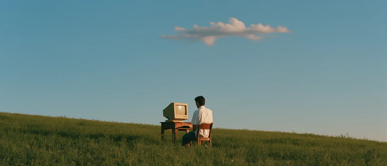
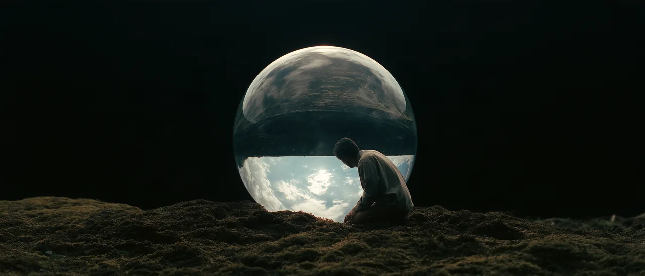
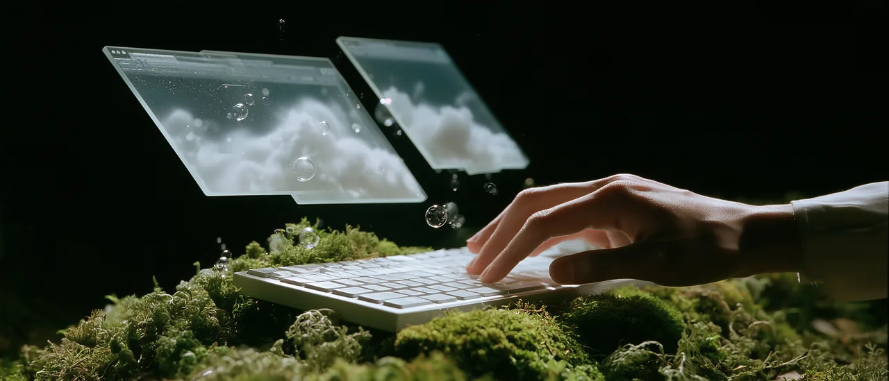
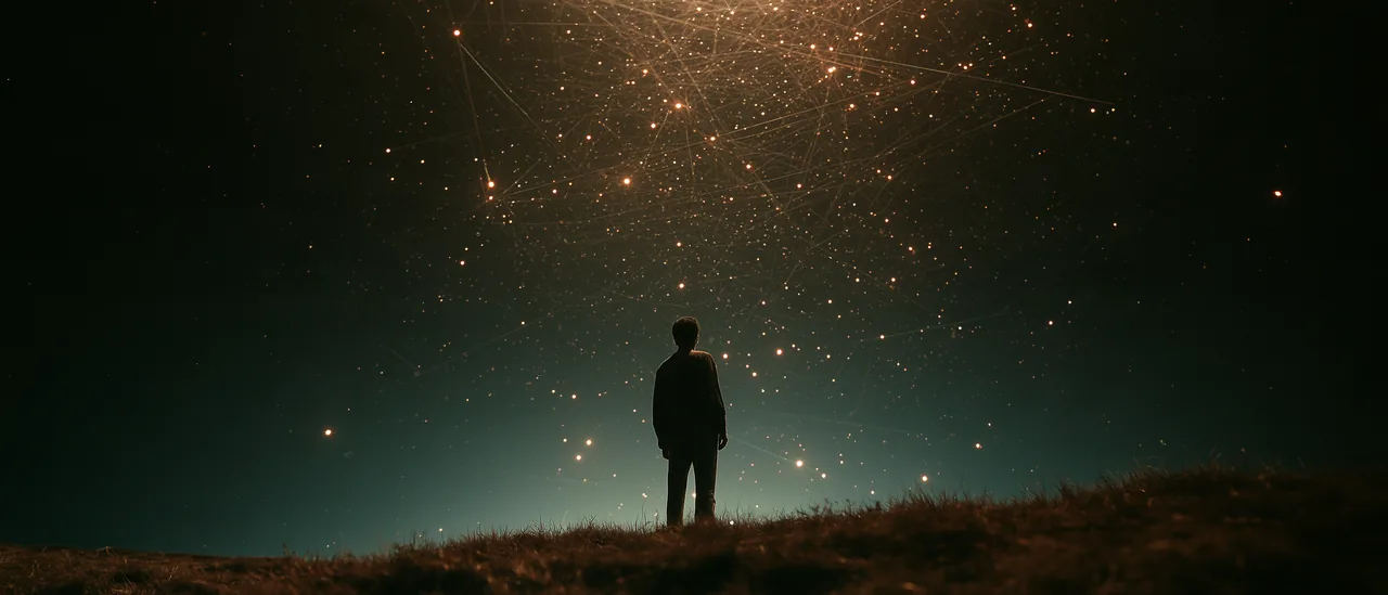
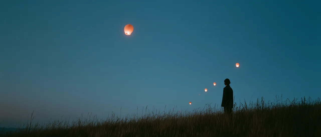
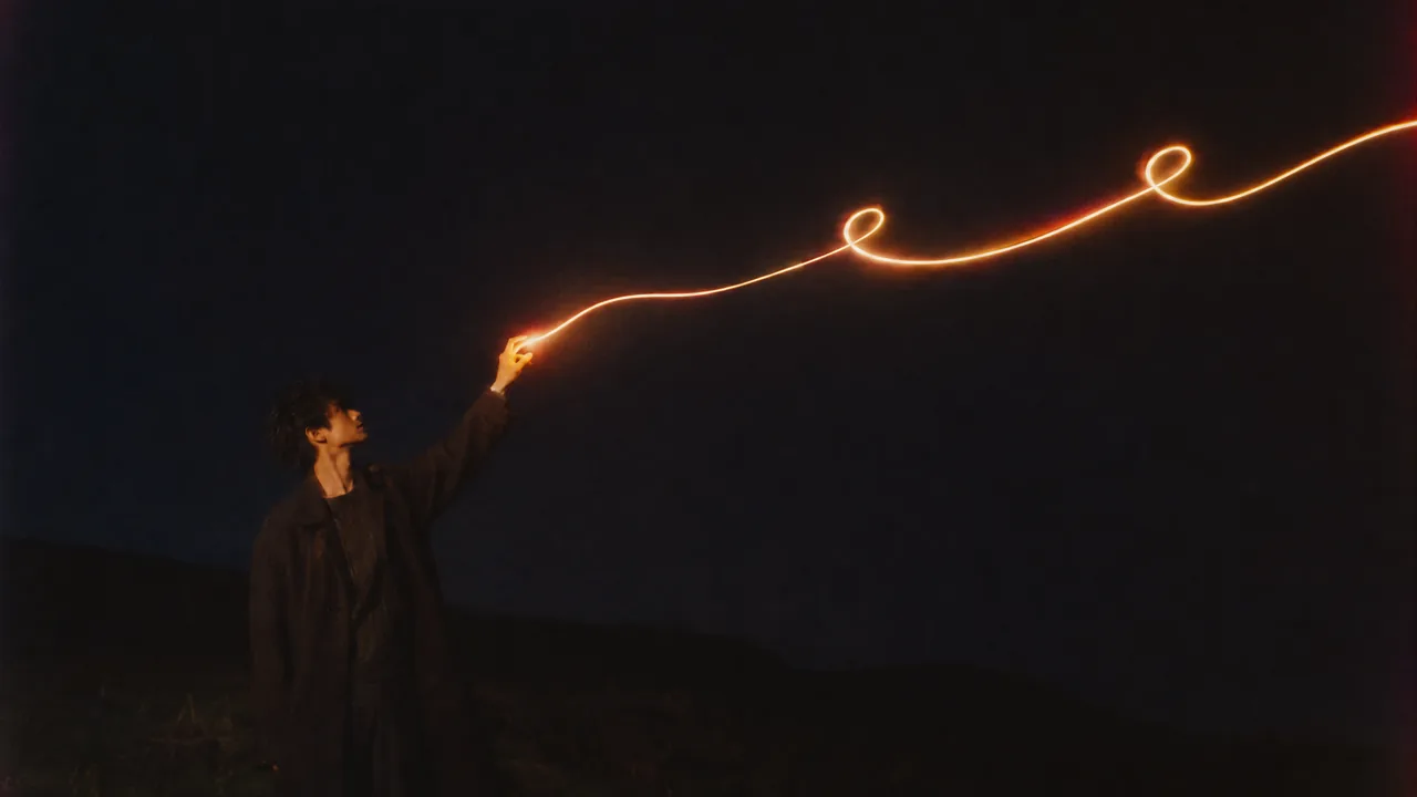
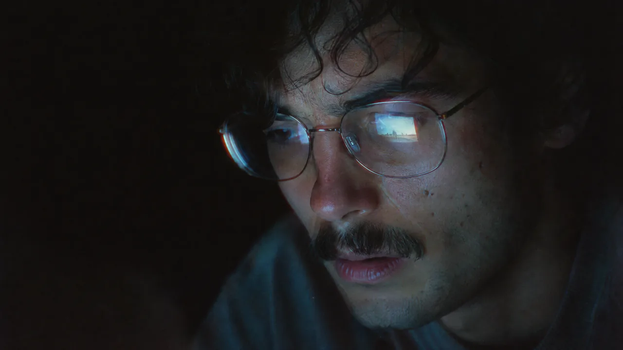
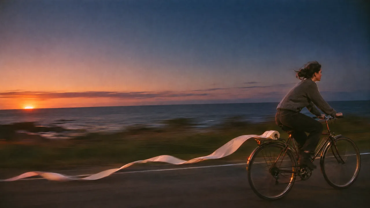
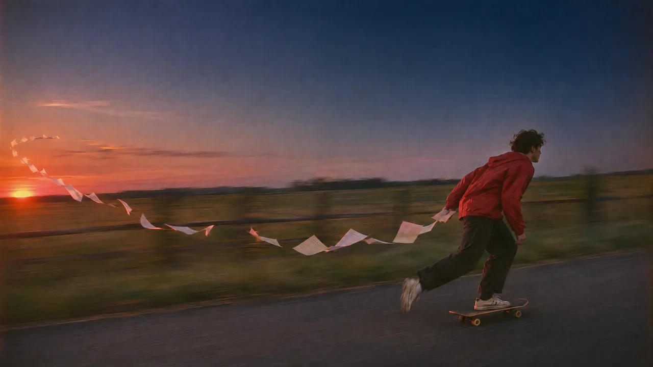
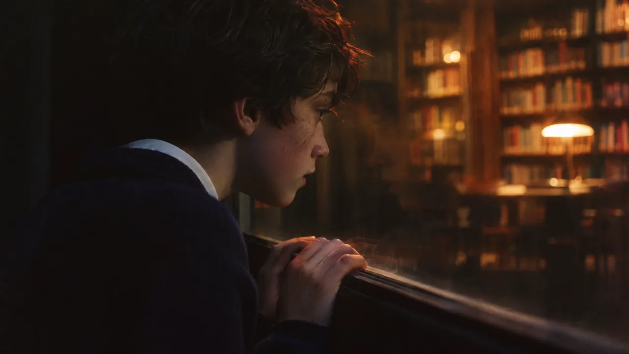
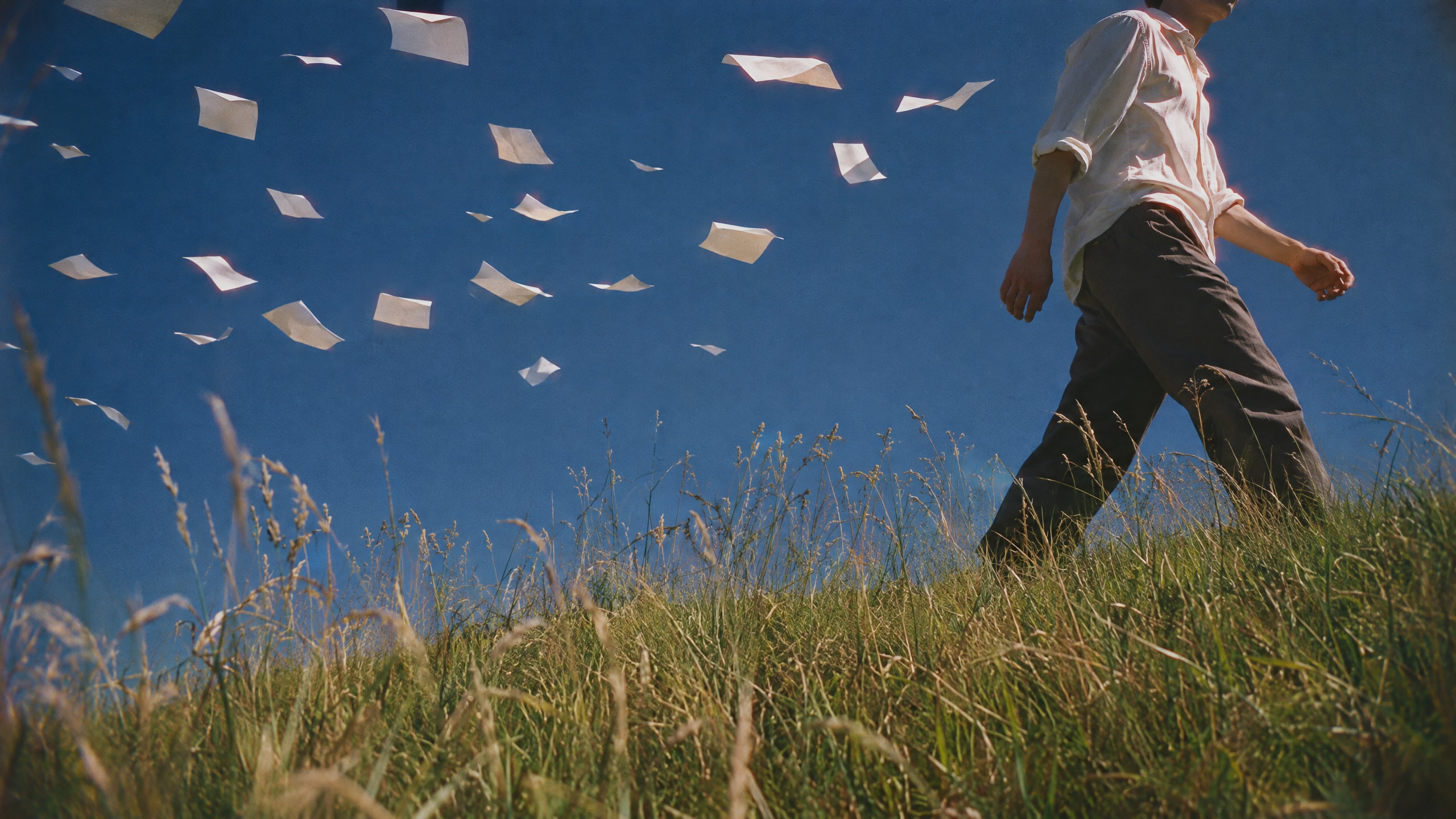
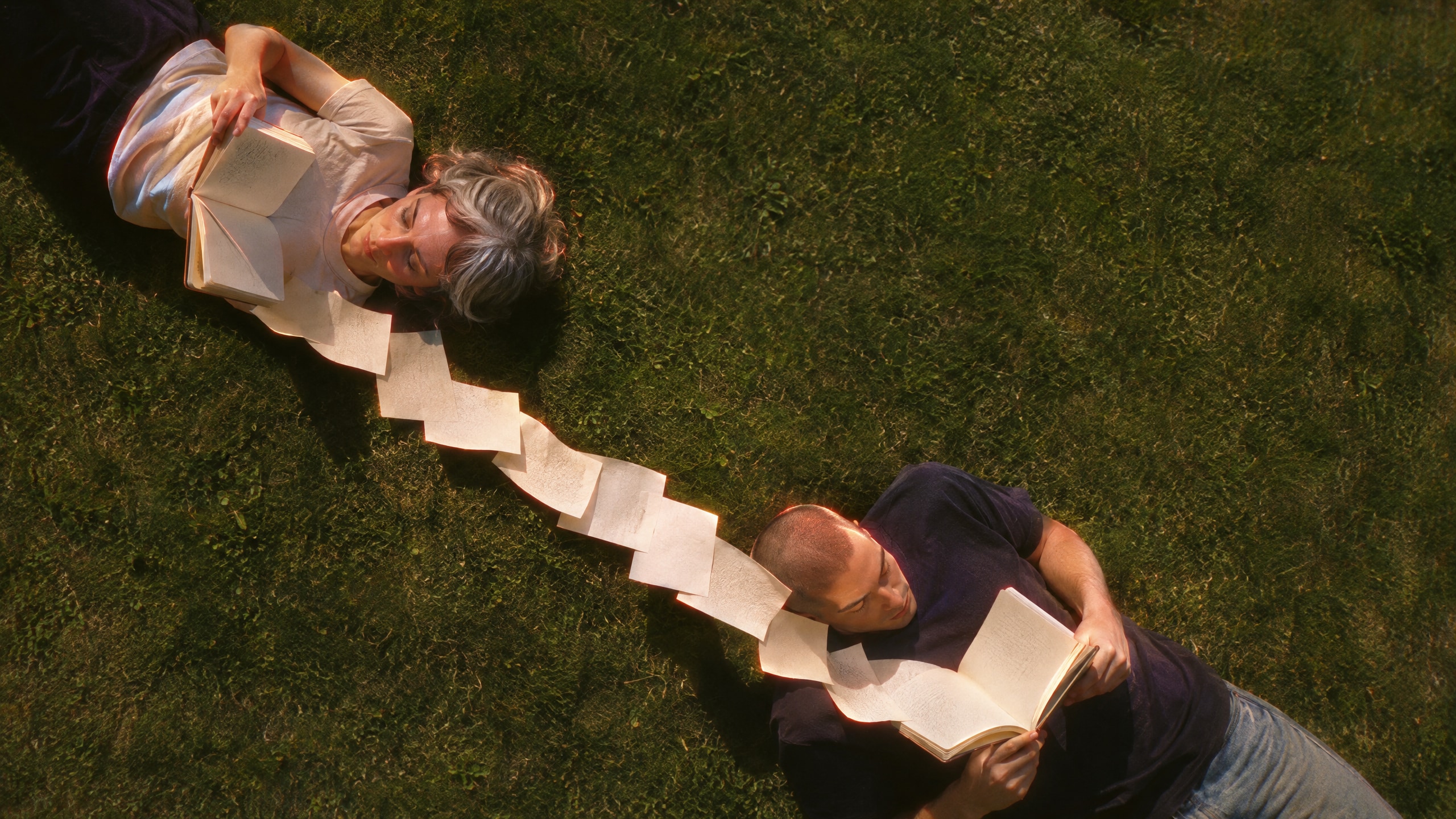
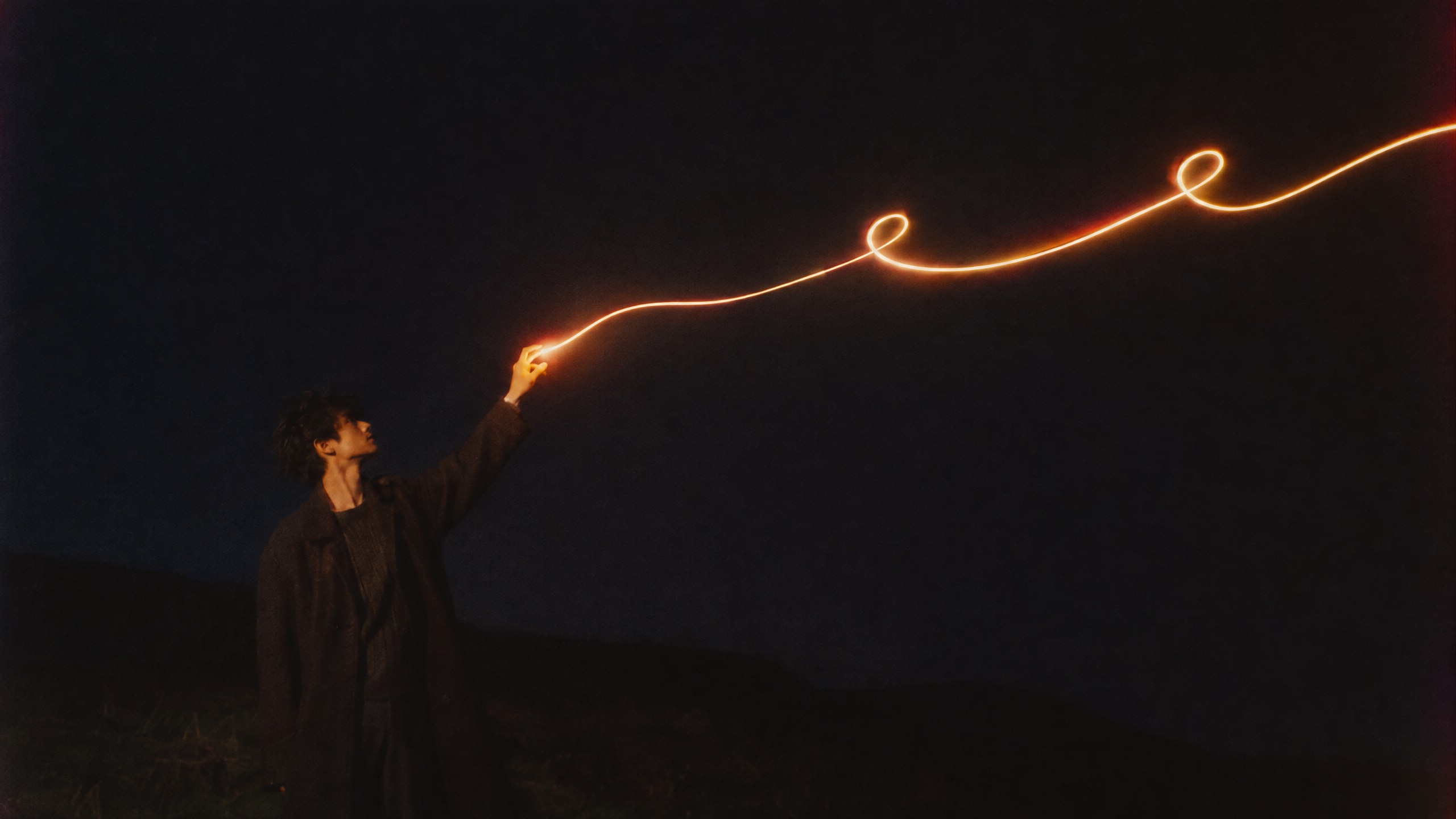
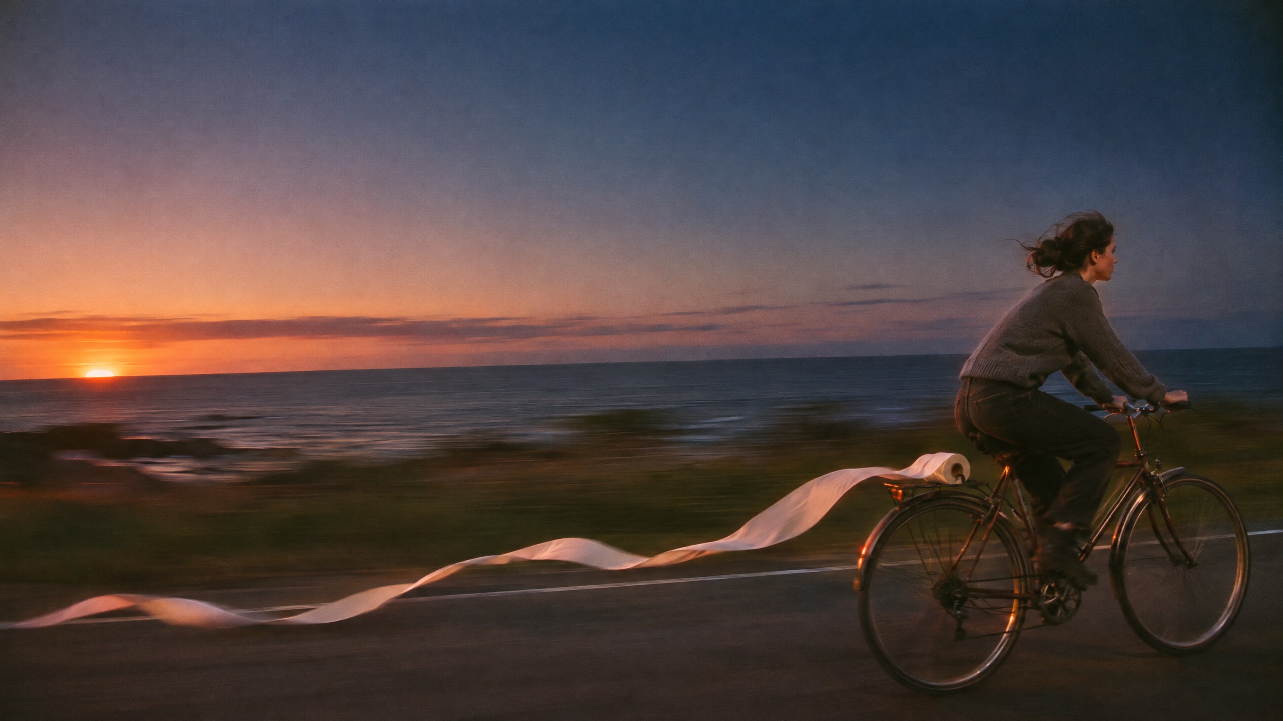
Brand photography looks like art photography from a contemporary photo book: 35 mm film, real people reading, thinking and making, and one impossible thing photographed as if it were ordinary. Four lenses, each carrying one brand word.

05.1
Method
Four rules that run through every lens.
- 01Every image has one dream device: suspended motion, a shift in scale, light from somewhere else, a slow shutter, a reflection. The dream comes from what happens in the frame, not from a filter.
- 02There is one light that matters: a glowing page, a lit doorway, a lamp, a screen. The light is Askvel; the person is always the user.
- 03People wear everyday contemporary clothes, are caught mid-task and never look into the camera. Two people per image at most.
- 04A set uses at least two lenses, with no more than half Horizon; the light moves between day, dusk and night.
05.2
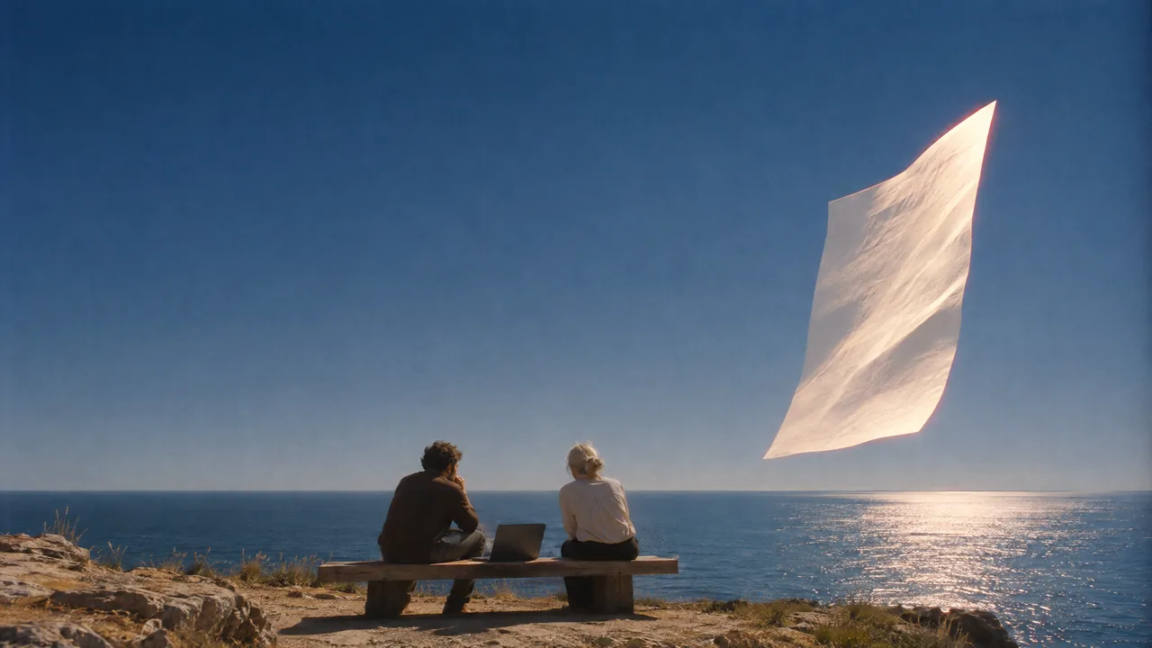
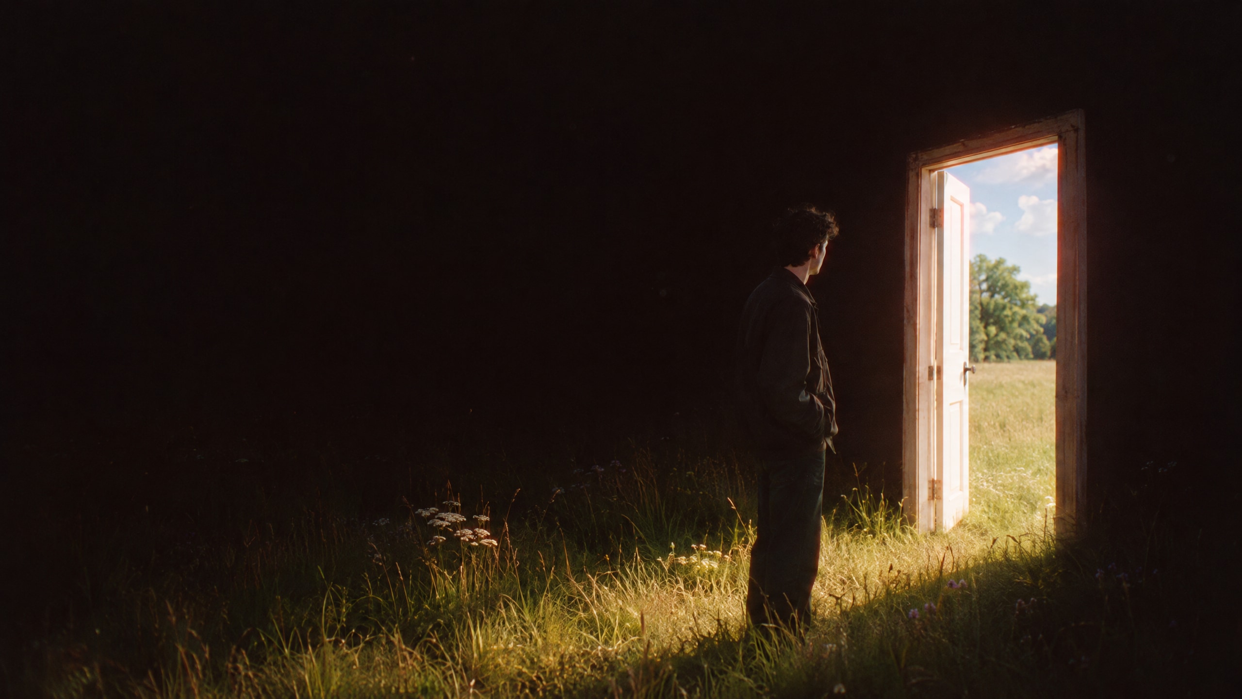
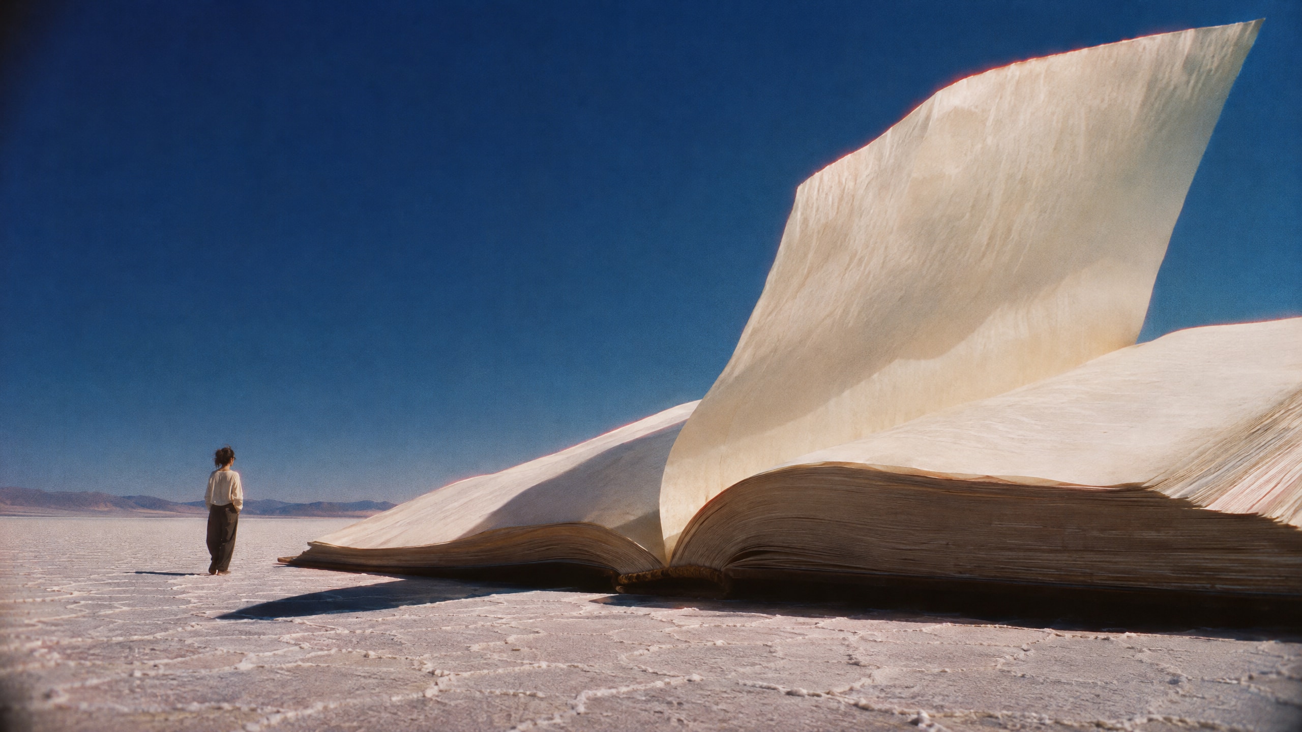
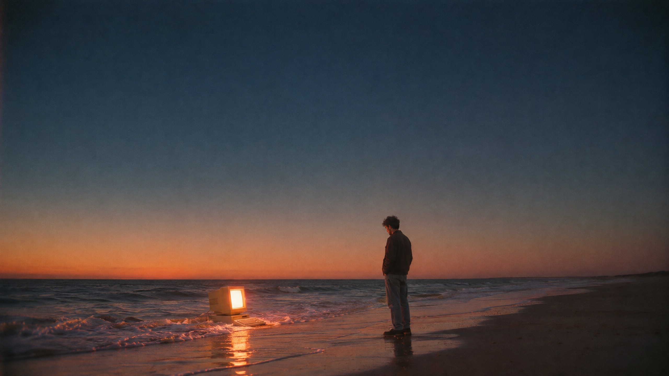
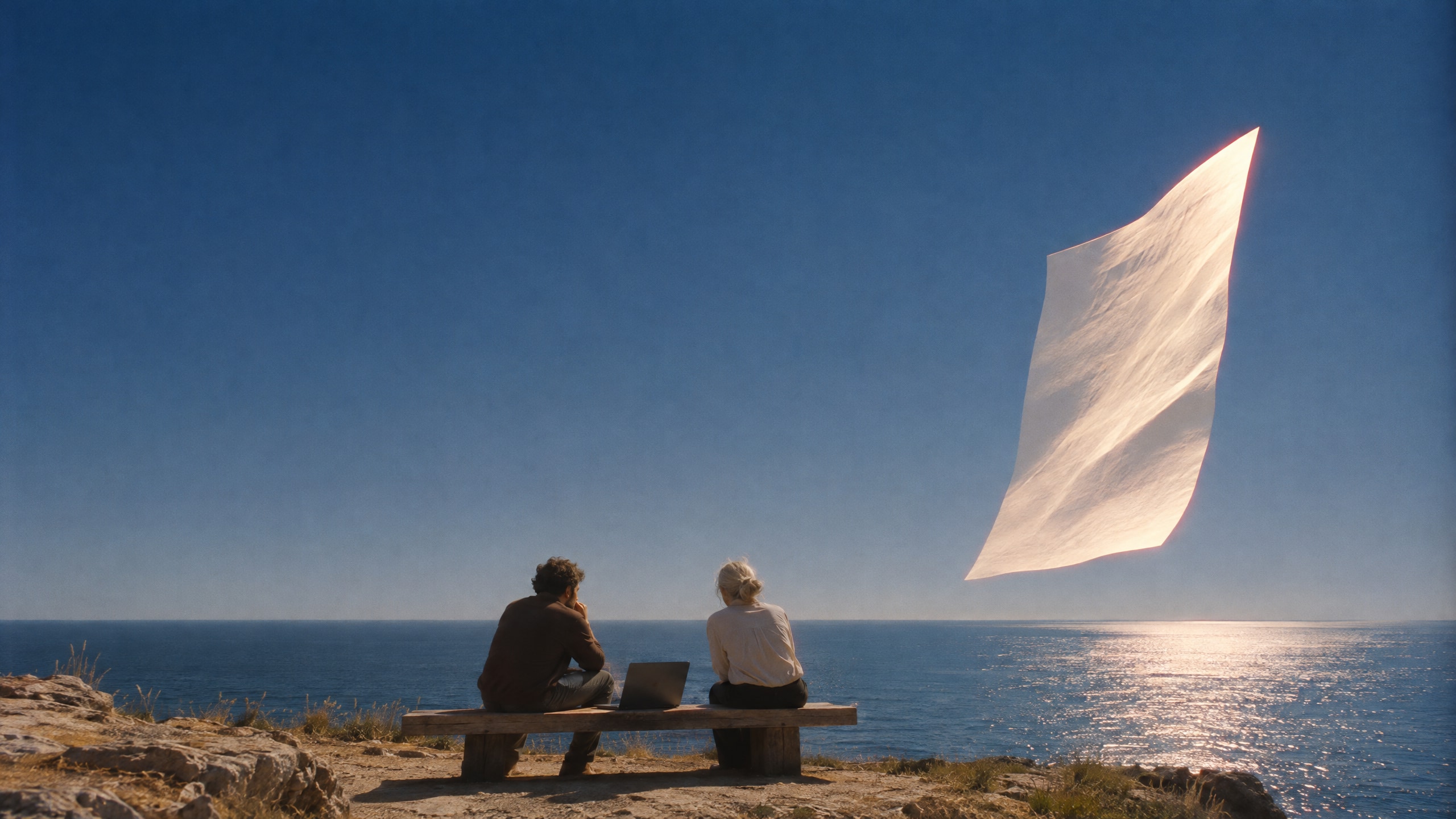
Horizon
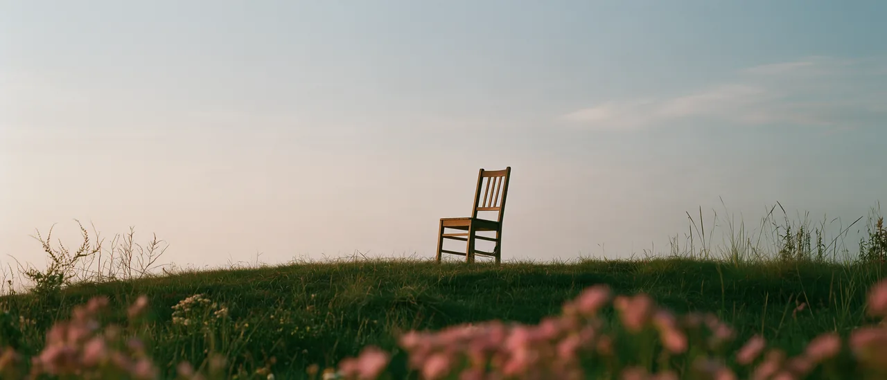
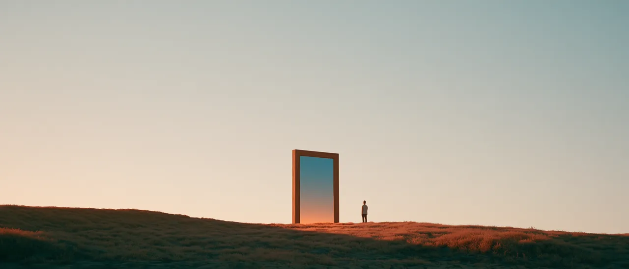
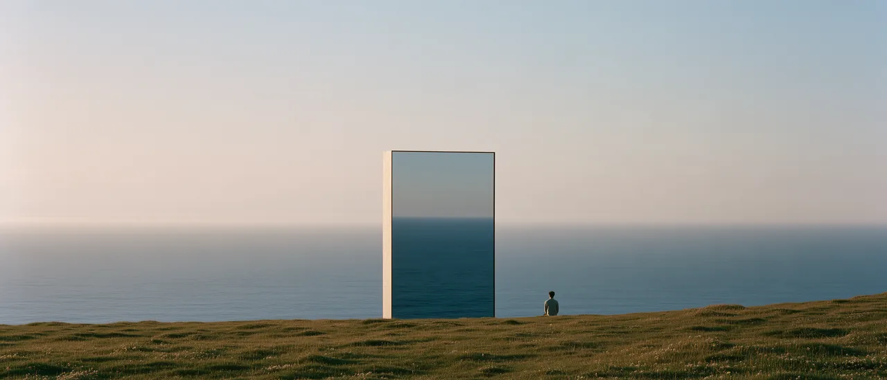
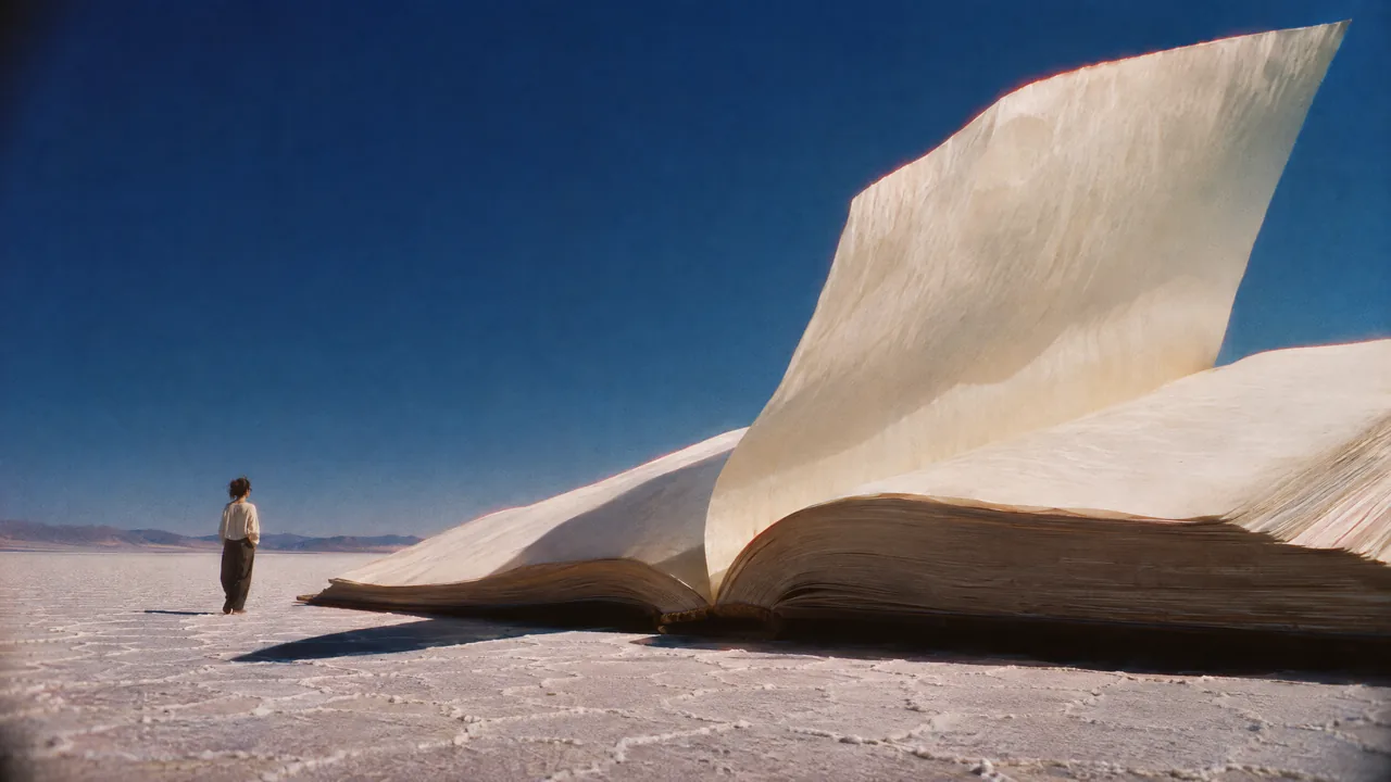
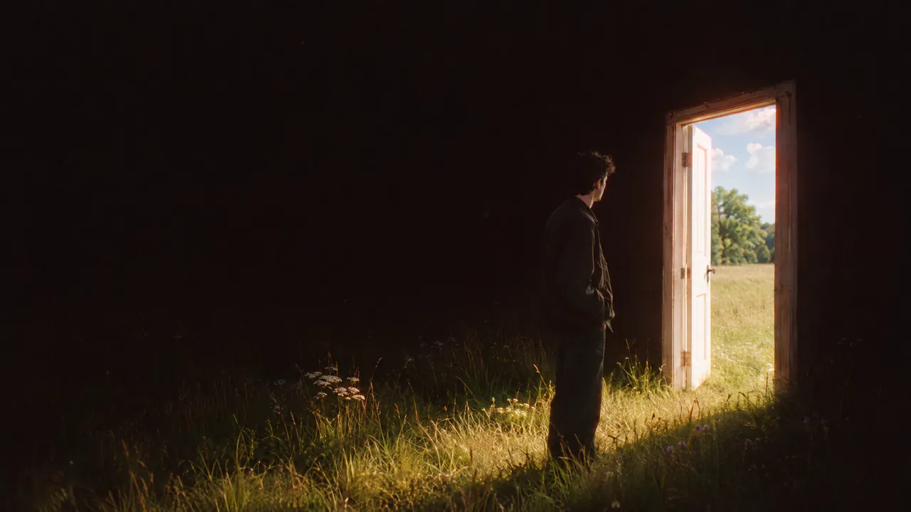
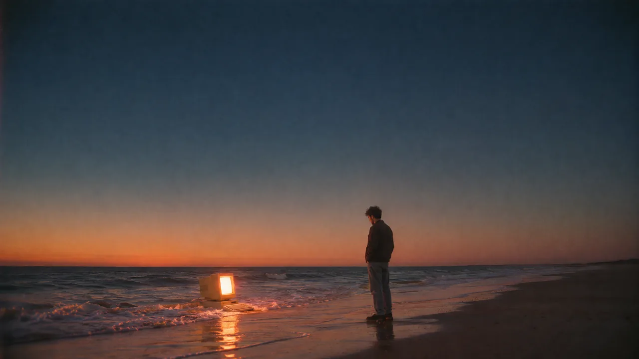
Calm: Eye level, a very low horizon, one small subject and a big sky: room for a headline and for thought. Text sits on the sky, never on the subject.
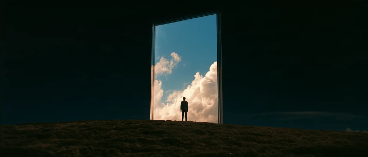
Daylight at nightA doorway in a night meadow; through it a summer afternoon, its sunlight spilling out.
The giant bookA book taller than a house on a salt flat, one page lifting in the wind.
At the waterlineAn old computer at the edge of the surf at dusk, the waves carrying its light.
Paper sailTwo people on a cliff-top bench; over the sea a giant sheet of paper stands like a sail.
05.3
Angle
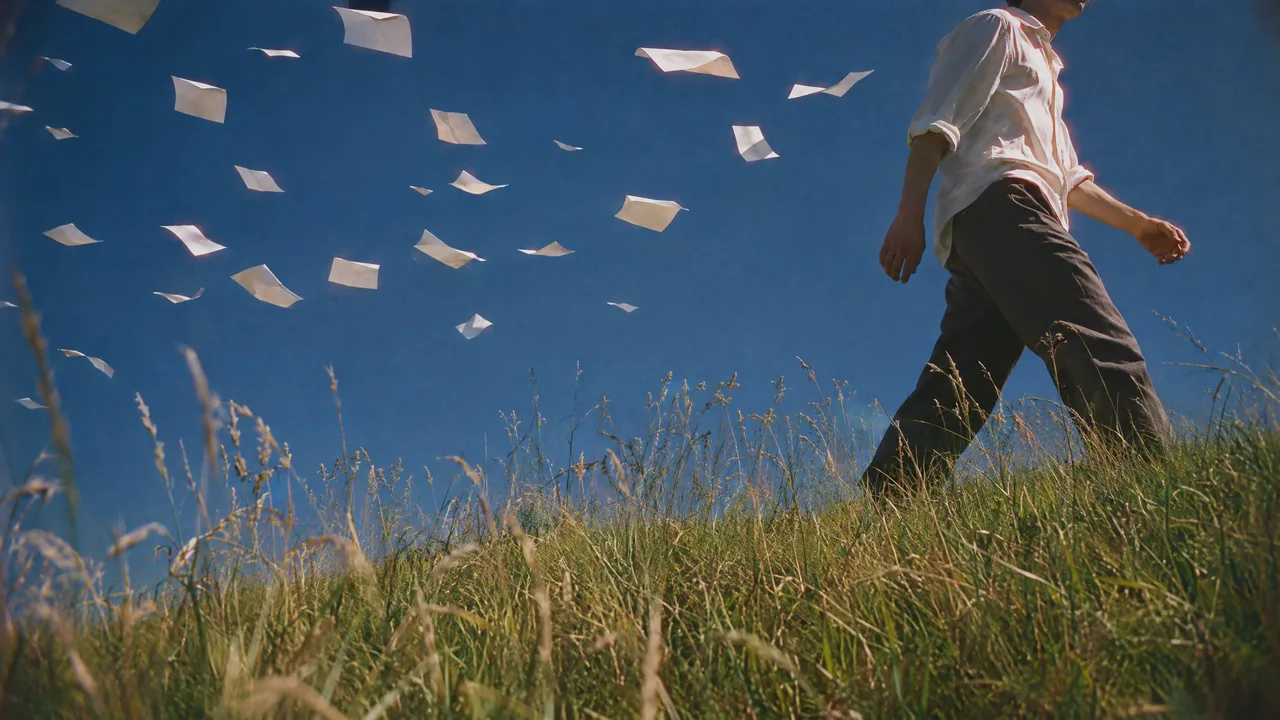
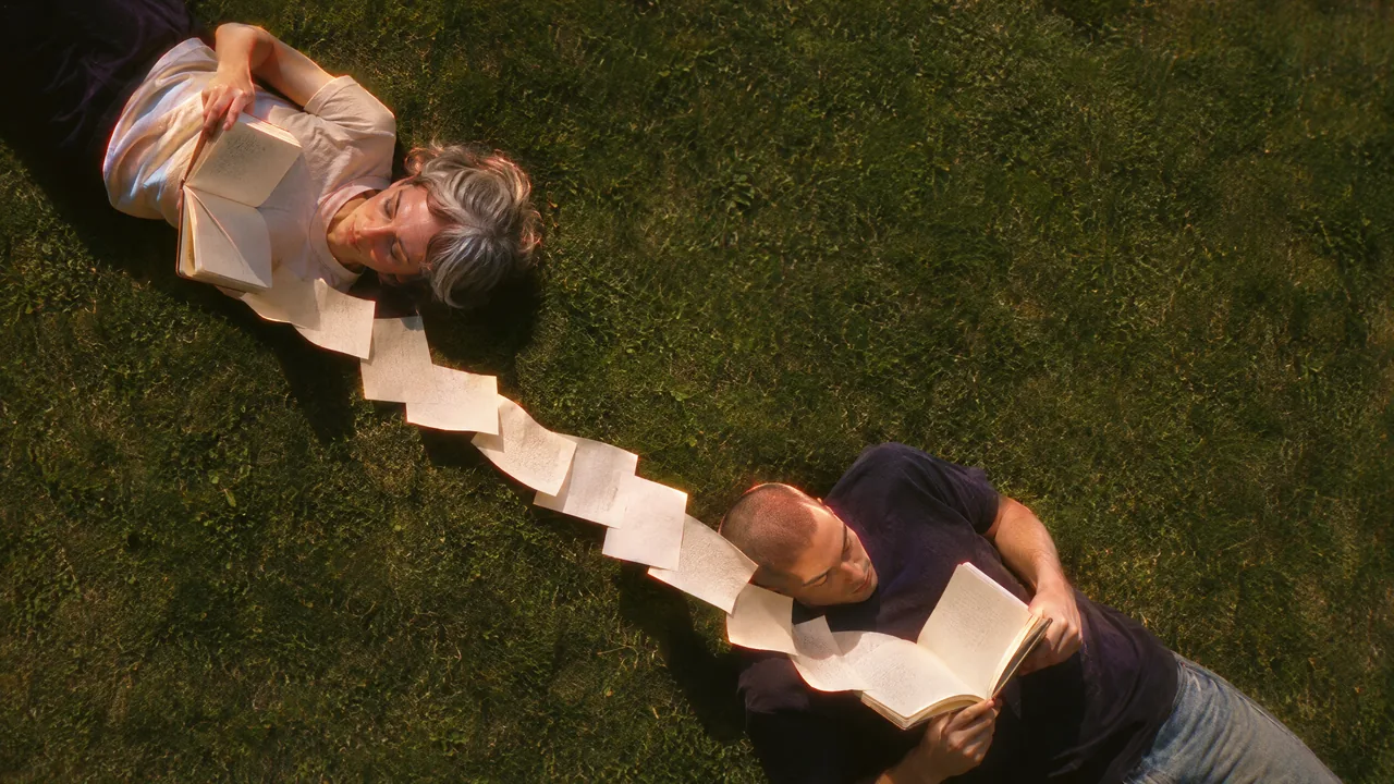
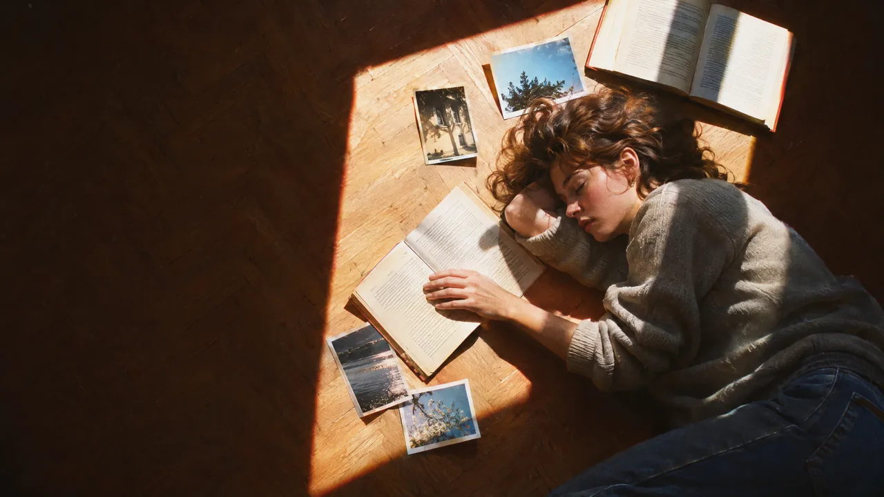
Socratic · the question: A familiar moment from an unexpected viewpoint: straight up from the ground, straight down from above, through a gap. Look at it differently first.
Sky above the shelvesLooking up between tall bookshelves to where the ceiling is blue sky and one cloud.
A flock of pagesA man walking over a hill crest, loose pages hanging still above him like paused birds.
Joined notesTwo people lying head to head on the grass, loose pages joining them in one line.
Afternoon floorFrom above: asleep on a sunlit floor among books and photographs.
05.4
Flow
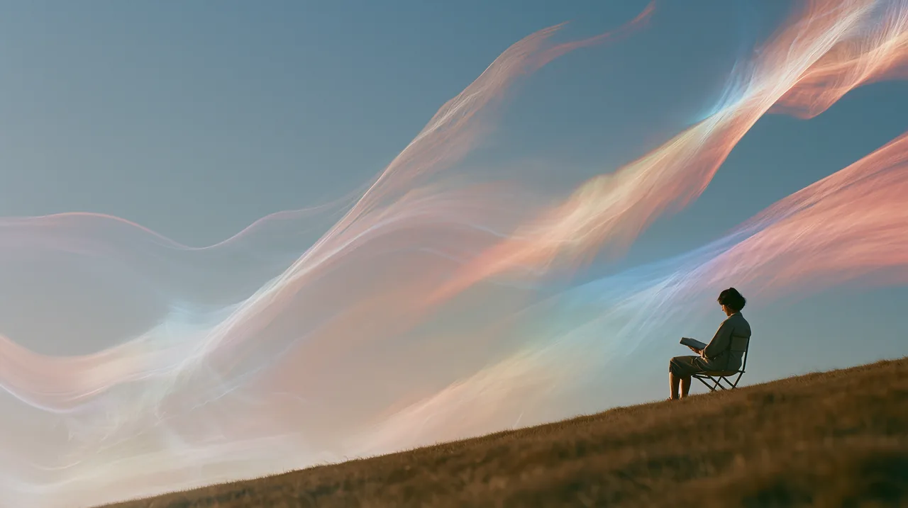
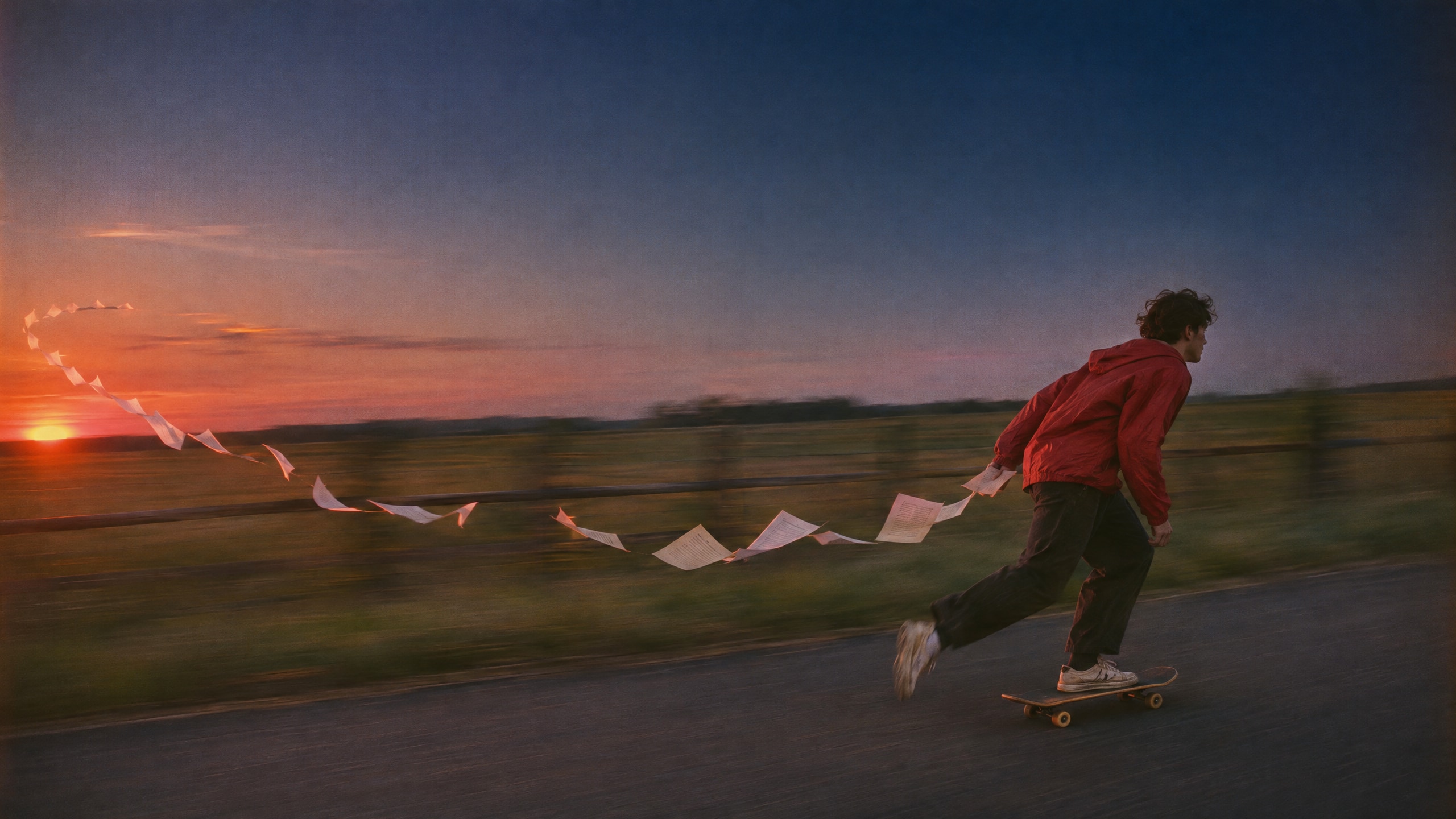
Fluent · one stroke: Under a slow shutter, one unbroken trail of light, paper or wind, like a line written without lifting the pen. Or a panning shot where the person is sharp and the world flows.
05.5
Depth
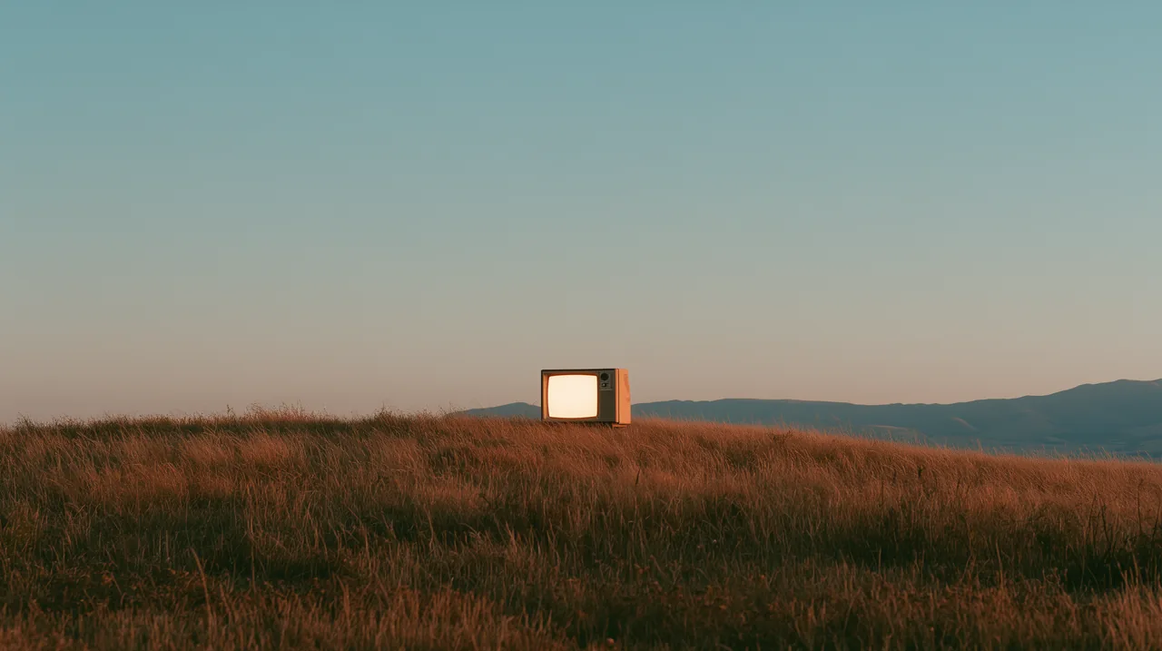
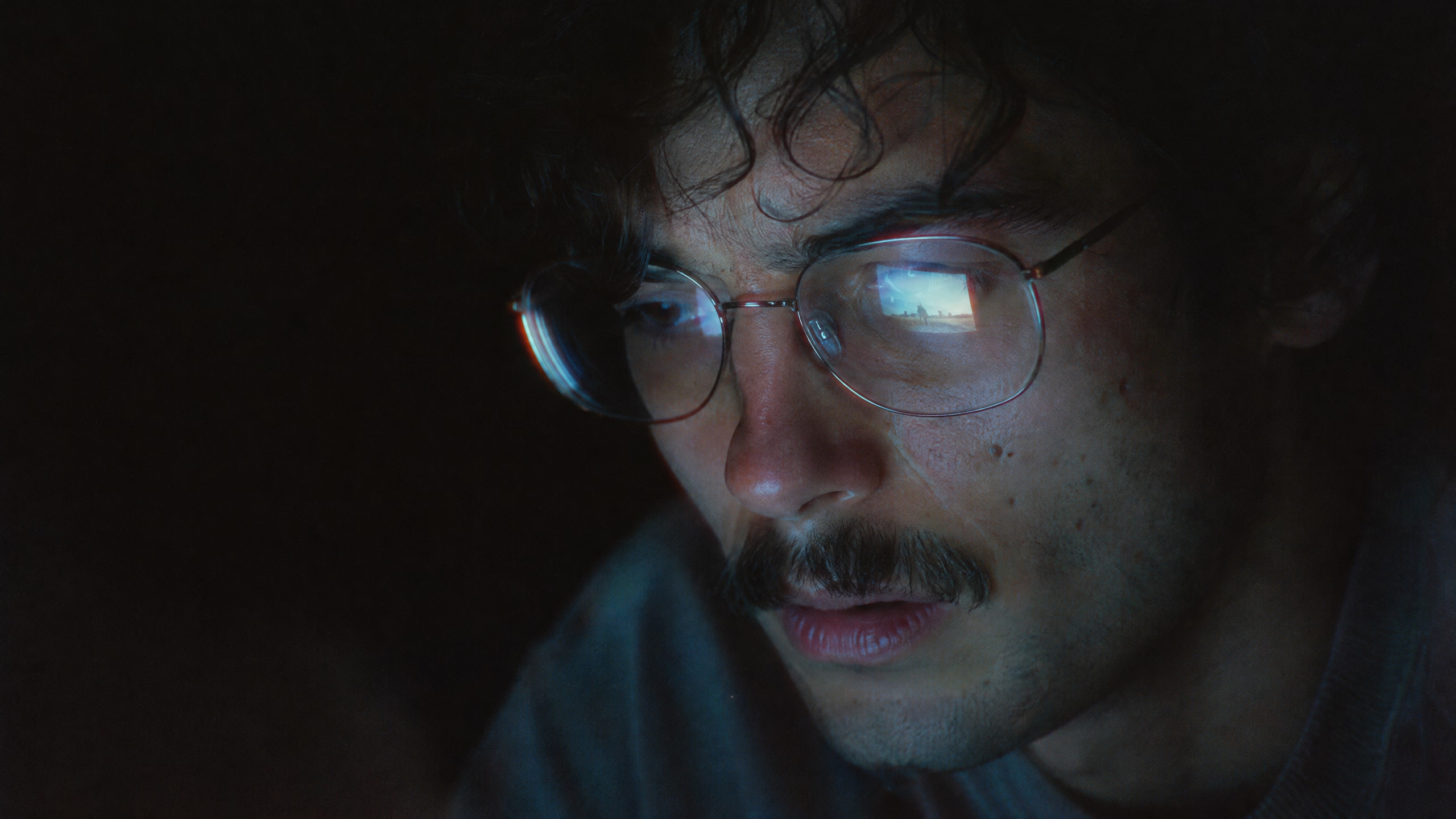
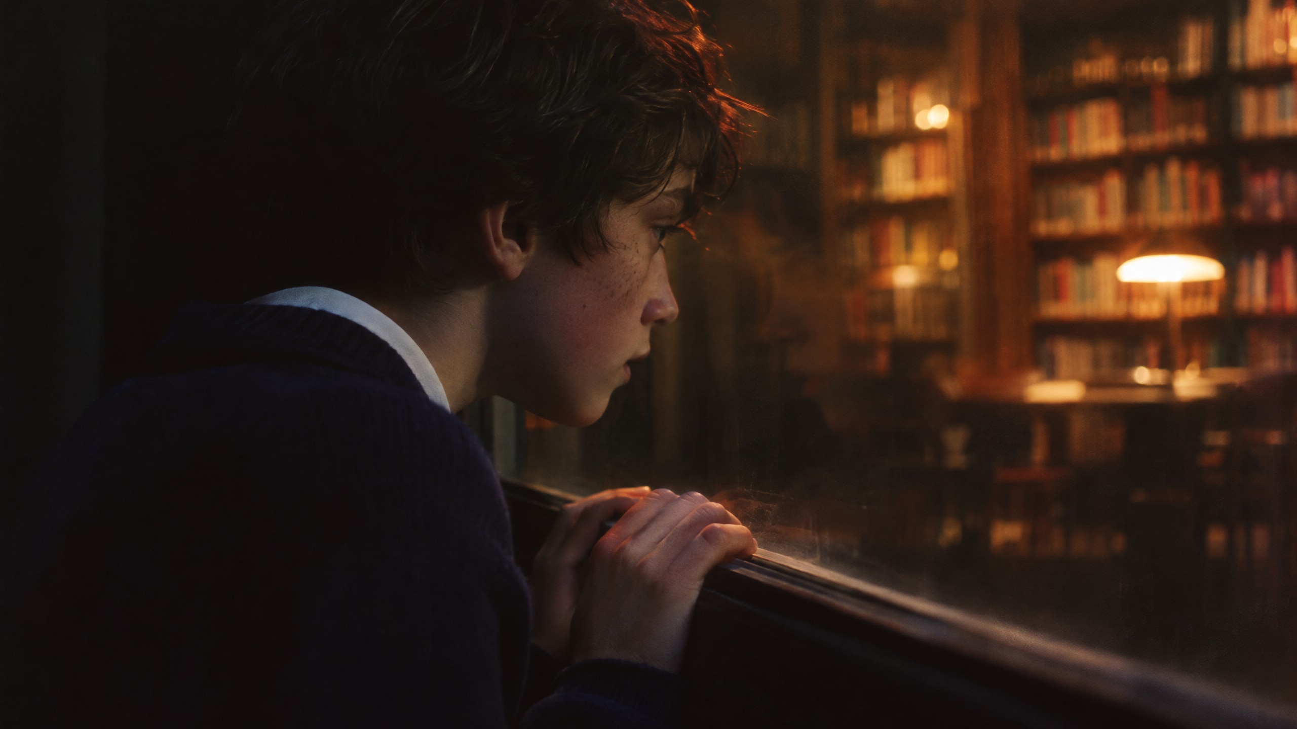
Erudite · focus: Very shallow depth of field and a single light: one face, one pair of hands, one book in focus; everything else sinks into soft blur and shadow.

05.6
Gallery
All scenes and illustrations live in a separate gallery. Filter by lens and light, download at full size.
05.7
Avoid
What never appears in Askvel imagery.
- 01Stock images that could belong to any software company.
- 02Robots, glowing brains, futuristic dashboards and generic AI hands.
- 03Blue-purple tech haze, neon, heavy glow or glass effects.
- 04Images added only to fill space.
- 05Crops that cut through the subject or put text on it.
- 06Images without cleared usage rights.
Graphics
Three graphics derived from the mark, and the hand-drawn illustration. The board shows the first three in use.
Turn this scan into a chart
Reading the table06.1
Cropped mark
One part of the mark, enlarged until it runs off the edges. It goes on covers, divider bands and the backs of cards.
- 01Keep the arrow or the inner loop whole in the frame. Those are the parts people recognise.
- 02Let the stroke leave the frame on at least two sides, and move the window until no edge leaves a thin sliver.
- 03Enlarge only. Never rotate, stretch, outline or redraw the shape.
- 04One crop per surface, in one color. If the logo appears too, keep it small and give it its full clear space.
06.2
The loop line
A chain of small loops that runs into the mark: the mark's own pen stroke, repeated. Use it as a signature, a progress line or a horizontal divider.
06.3
Outline pattern
The outline of the mark, drawn as a hairline and repeated in offset rows. A quiet background for packaging, event walls and large covers, with the solid mark or a title on top.
- 01Trace the edge of the mark with a hairline. Every outline is the same size, and none is filled.
- 02Shift every other row by half a step. End the frame on whole rows at the top and bottom; only the sides may cut through a mark.
- 03Keep the lines faint: Ink at 20% opacity on light surfaces, white at 28% on dark.
- 04Around a solid mark or a title, remove every outline that touches its clear space x.
06.4
Illustration
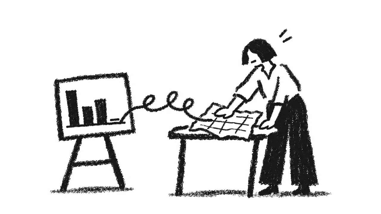
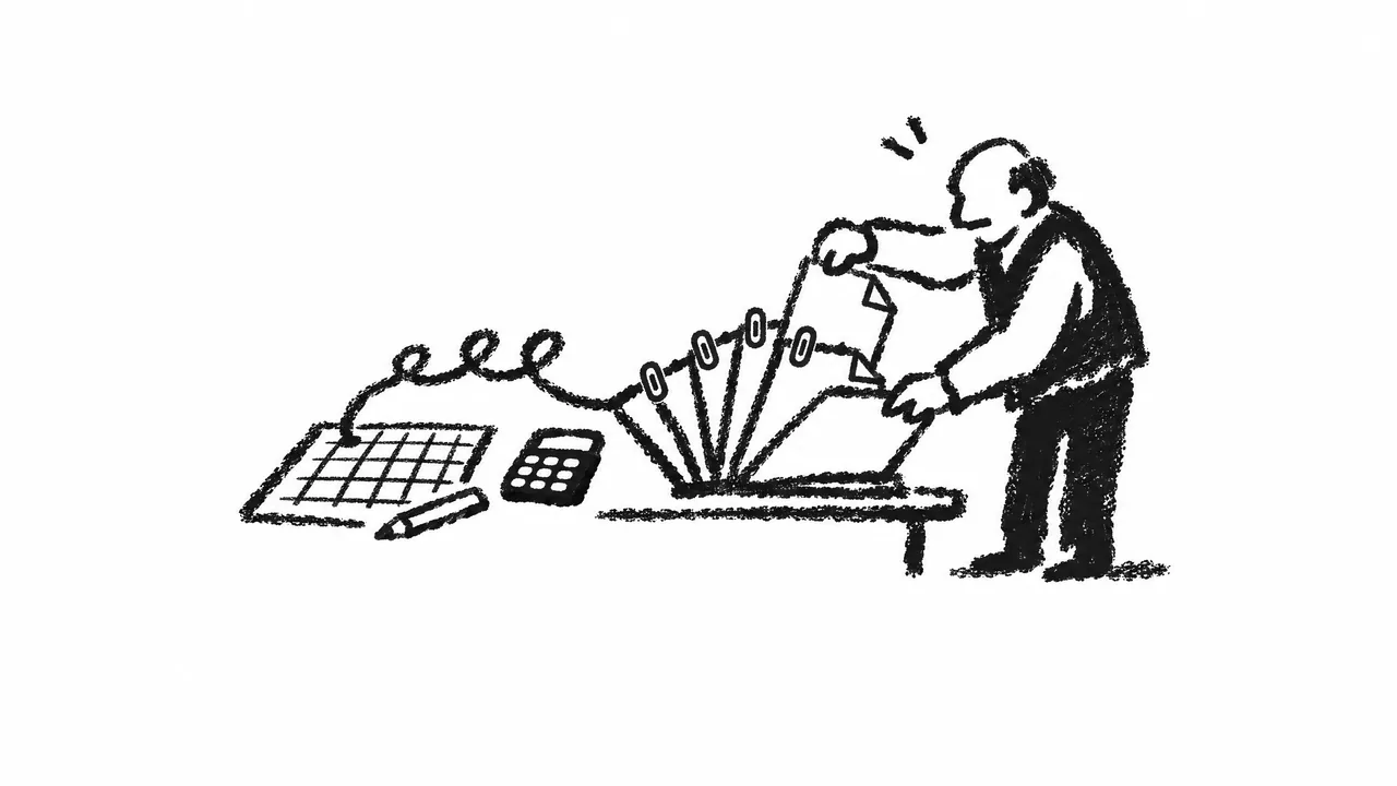
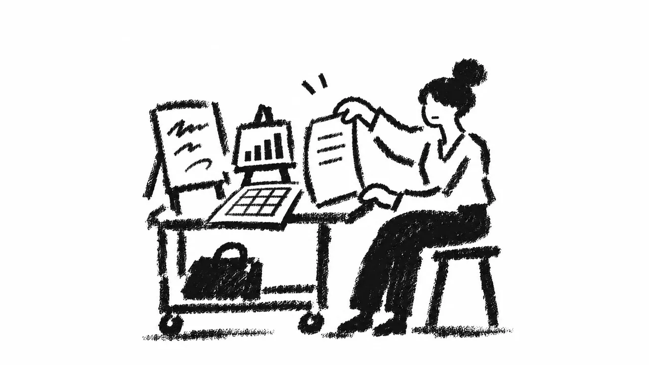
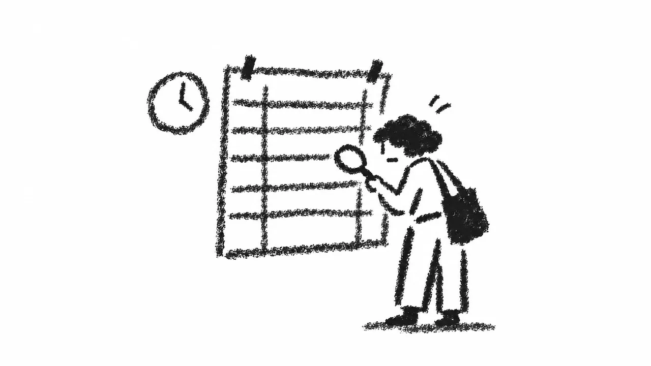
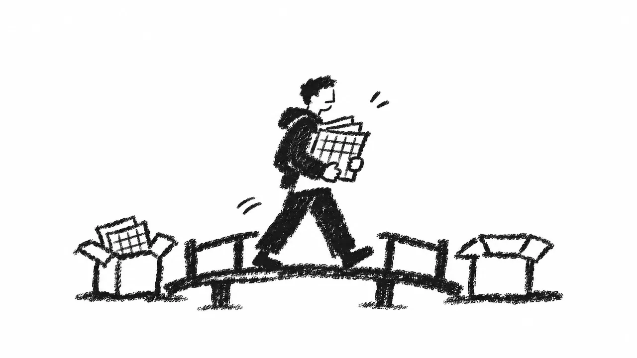
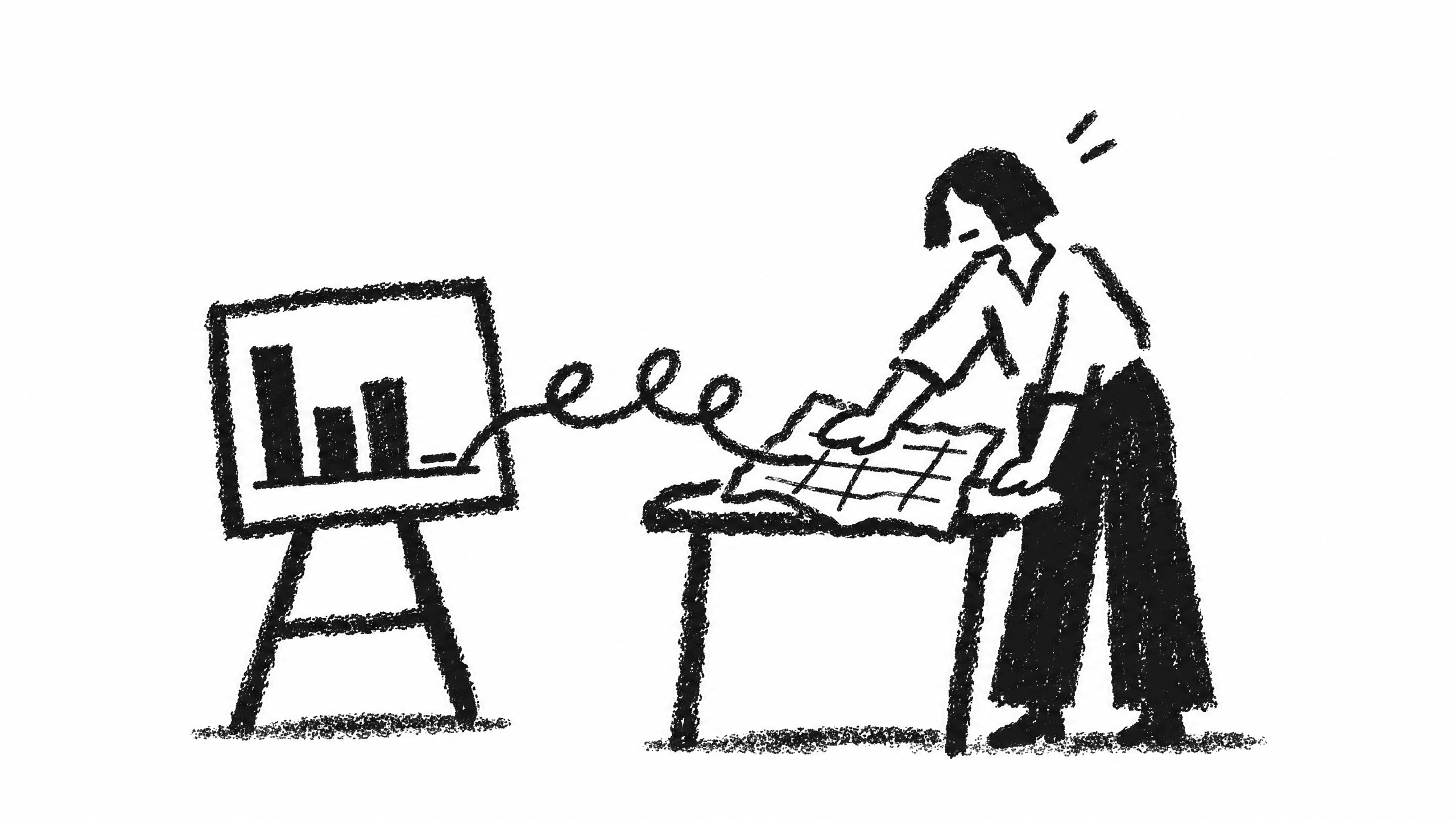
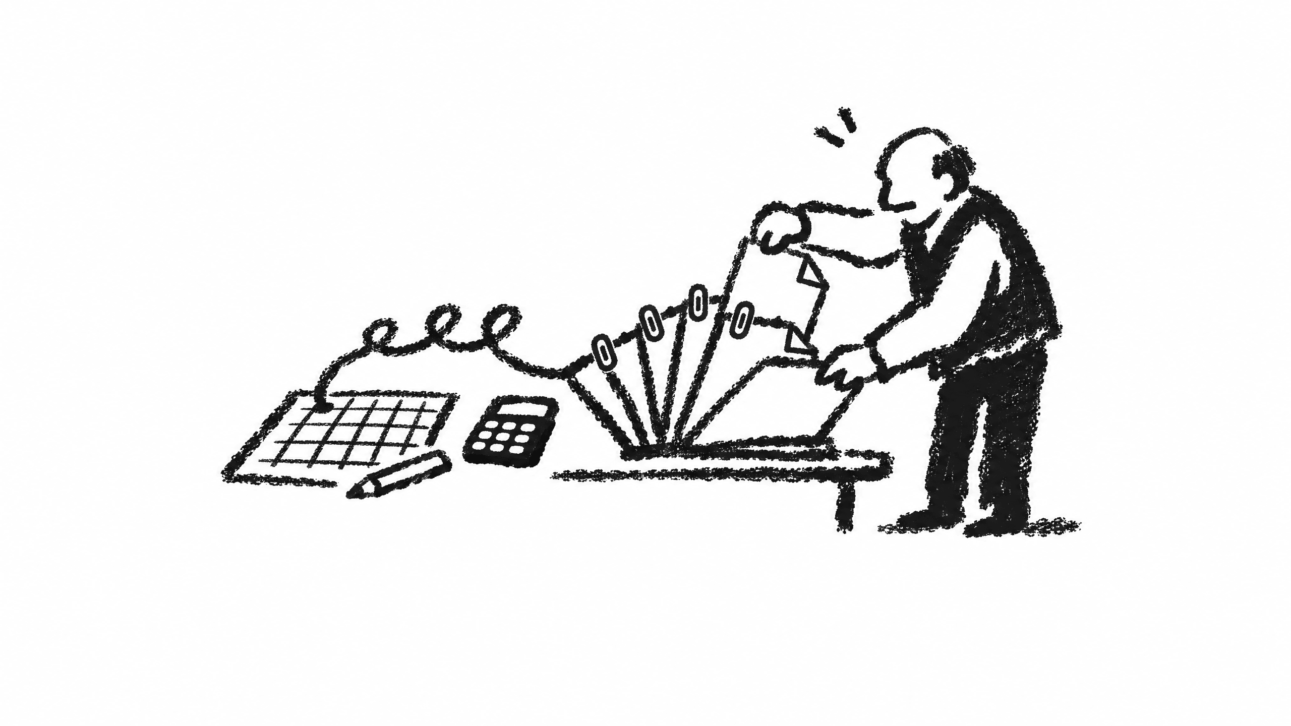
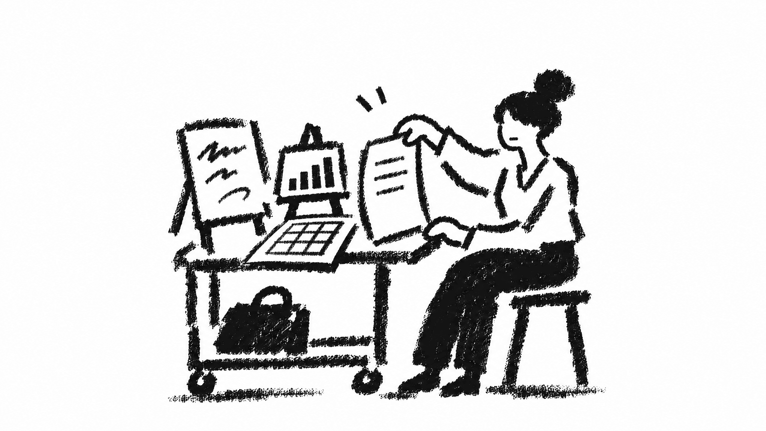
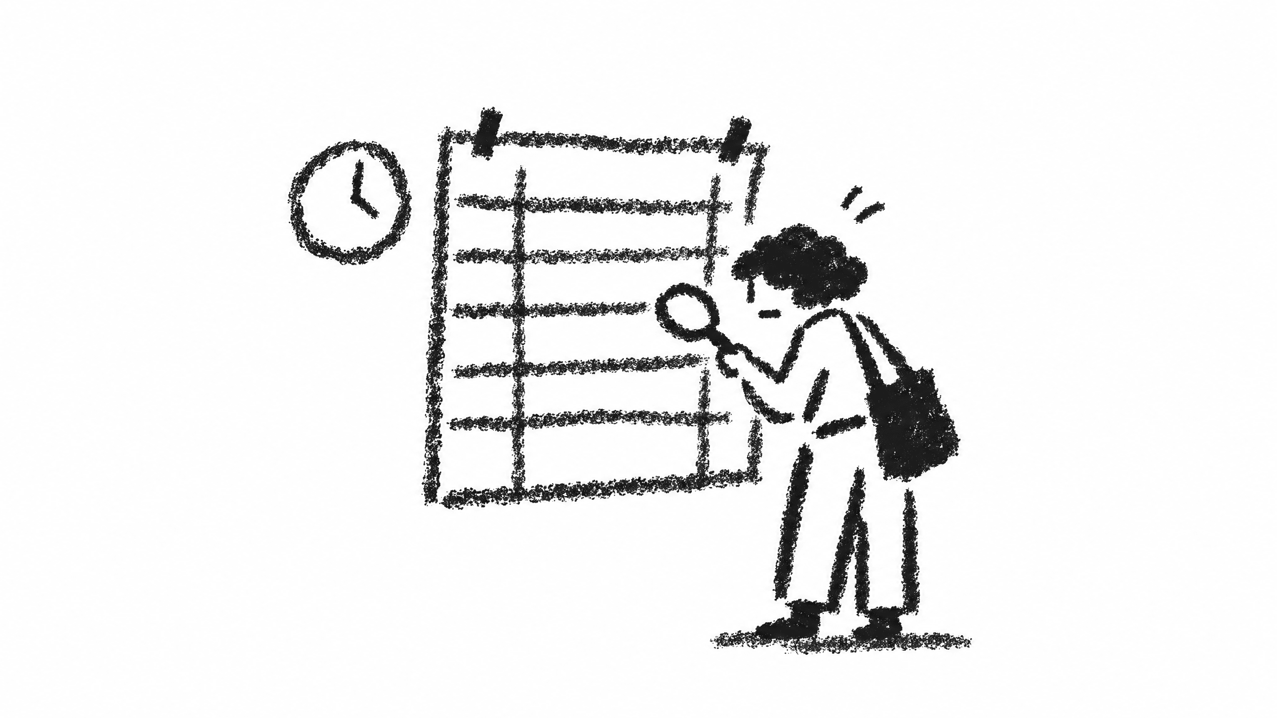
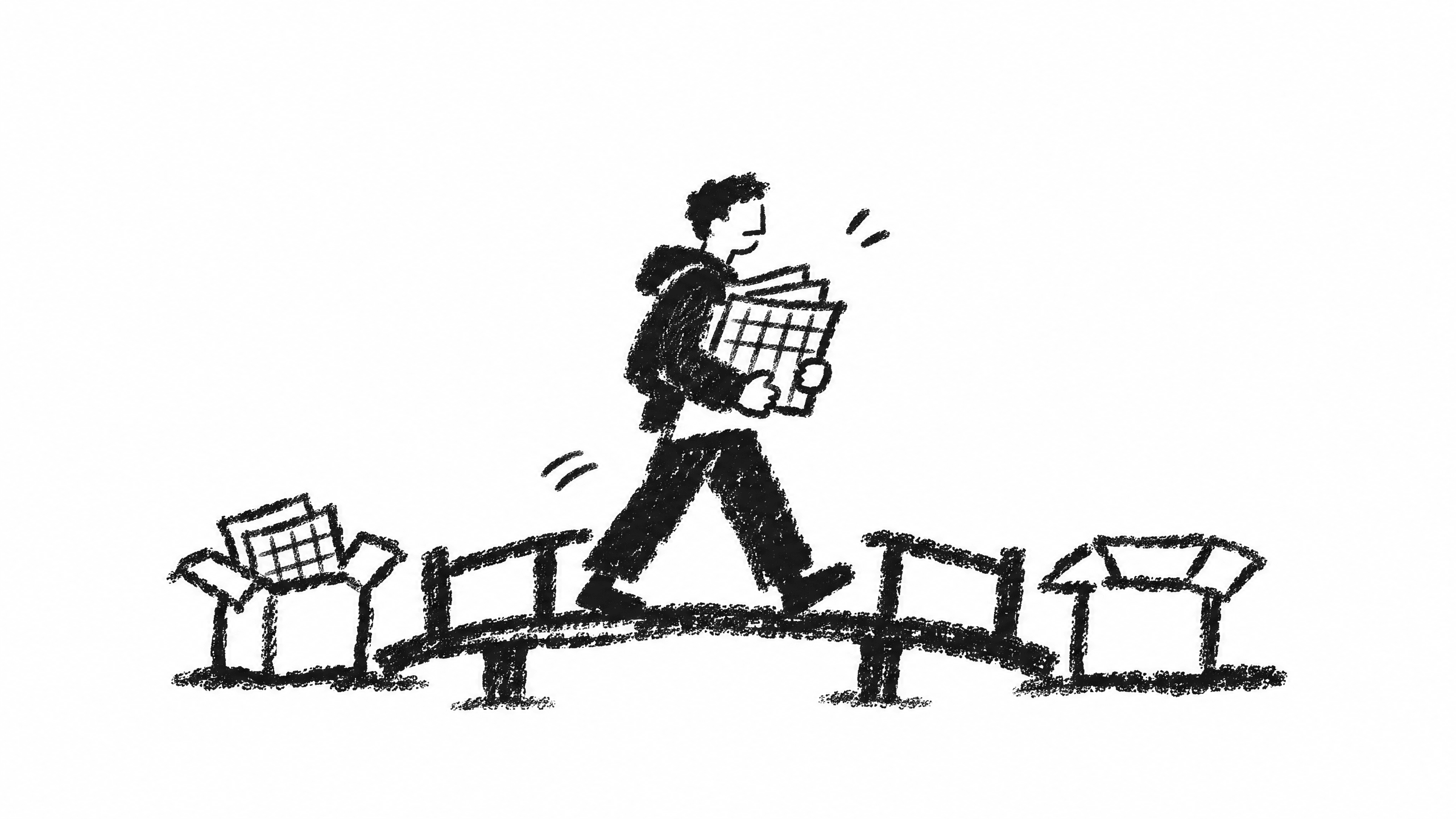
Black-and-white reportage sketches: ordinary people caught in one small moment of working, studying or living, drawn in a few seconds. Used for blog covers, social posts and website art. There is always a person in the picture.
- 01A fast china-marker sketch. Every stroke stays bold and lines rarely close. No vector smoothness, no wispy re-tracing.
- 02Only black and white. Tone comes from how dense the grain is. Never grey, never colour. Light clothes are left as white paper, edged on one side.
- 03Plain adults, about six heads tall, no eyes; each pose tells a tiny story. Three people per image at most.
- 04When one thing turns into another, a single loop line runs from the source to the result: the same stroke as the mark. Once per image.
01Checking the deliverablesCross-legged, a magnifier over a spreadsheet, PDFs, a report and a chart laid out in a row.
02Scan to chartSmoothing a crumpled scanned table; the loop line runs to a bar chart on the easel.
03PDFs to a spreadsheetSlipping a new page into a fan of PDFs; the loop line flows to a grid sheet, a pencil and a calculator.
04Picking the right toolTaking a document off a cart that also holds a spreadsheet, a chart easel and a whiteboard.
05Checking the scheduleGoing over a wall chart row by row with a magnifier, a clock beside it.
06Moving the sheetsCarrying a stack of spreadsheets over a small bridge, from an old box to a new one.












Motion
Because the mark is one stroke, it can be written, traced and looped. These loaders ship as a small script you can drop into any page.
07.1
Logo loaders
The whole mark stays on screen; the motion happens within its own stroke.
L1 · Write
The mark is written in its own stroke order, holds, then is erased the same way.
Launch screen, hero, brand intro
L2 · Loop
The C and the arrow stay put; the pen fills the loop and draws back out.
General and section loading
L3 · Spin
The mark stays whole while a small gap travels round the loop.
Inside buttons, inline status, small sizes
L4 · Trace
A faint mark underneath; a stretch of ink runs from the C to the arrow.
Long tasks, background sync
L5 · Type
Small loops are typed after the mark, pushing the arrow like a cursor, then deleted back.
Waiting for a chat / AI reply
L6 · Progress
Determinate: the mark is written up to the current progress; the arrow lands at 100%.
Uploads, exports, installs






07.2
Combo loaders
The mark and the auxiliary loops move together: the motion travels from the loops into the mark.
C1 · Relay
One stroke writes the small loops, then the mark; the arrow pops out and back, then it all erases.
Launch screen, hero, brand intro
C2 · Wave
Each loop loosens and redraws in turn; the wave reaches the mark and the arrow bounces.
General and section loading
C3 · Unfurl
The mark slides right and pulls a line of loops out behind it, then folds back.
Launch screen, empty states, brand moments
C4 · Feed-in
Ink flows along the loops into the mark while a gap turns inside its loop.
Long tasks, background sync, AI generating
C5 · Thinking
The loops light up in turn, ink slides into the mark and rewrites its loop; the arrow bounces.
Waiting for a chat / AI reply
C6 · Progress
The loops are the progress bar; the mark's loop turns meanwhile and closes at 100%.
Uploads, exports, installs






07.3
Loop loaders
The loop line alone, for places that don't need the mark.
E1 · Feed
The pen stays in place drawing loops while the trail feeds left and fades.
Full-screen or section loading, AI generating
E2 · Write
A line of loops is written left to right, pauses, and erases in the same direction.
First page load, empty states
E3 · Flow
Faint loops form a track; a stretch of ink travels through them at an even pace.
Long tasks, background sync, next to skeletons
E4 · Mini
One loop with ink turning inside it, still legible at 16 px.
Inside buttons and inputs, inline status
E5 · Thinking
Three loops light up in turn: the brand's “typing…” indicator.
Waiting for a chat / AI reply
E7 · Progress
Determinate: written along the Signature's stroke up to the current progress; the arrow finishes at 100%.
Uploads, exports, installs
E6
Signature
The small loops are written in one stroke; then ink spreads up and down from where the stroke lands and grows the arrow. It holds, fades and loops.
App launch, brand intro, hero
Split
ending="split"Ink spreads up and down from where the stroke lands, then grows the arrow. One continuous move.







07.4
Usage
Principles: the pen never lifts; easing is calm and symmetric; one ink color; respect prefers-reduced-motion by showing the finished mark.
<script src="https://brand.askvel.com/askvel-loader.js"></script>

<askvel-loader size="32"></askvel-loader>                     <!-- logo-loop by default -->
<askvel-loader variant="logo-spin" size="16"></askvel-loader>
<askvel-loader variant="signature" ending="grow" size="48"></askvel-loader>
<askvel-loader variant="logo-progress" size="40" id="p"></askvel-loader>
<script>document.getElementById("p").progress = 0.6</script>- 01Attributes: variant, ending, size (height in px), weight (stroke, default 14), speed (multiplier), color (defaults to the text color).
- 02Progress variants (logo-progress, combo-progress, progress) take el.progress = 0..1 and write forward along the stroke.
- 03Or use the standalone SVG files (as an img). They animate on their own; the exports are Ink #111 at weight 14.
- 04Strokes connect by overlapping ink: for transparency set opacity on the whole element, not a translucent color.
In use
More examples of the brand in use are coming soon.
Part 3 of 3
Resources
Press kit
Everything a journalist, partner or event needs: how to describe the product, the facts, and the files.
09.1
About Askvel
Use these descriptions as they are, or shorten them. Please don't change the product's name or capitalisation.
Ask for the deck.
Askvel is an AI chat that turns one sentence into finished work.
Askvel is an AI chat that turns a single sentence into a finished presentation, document, spreadsheet, image, video or web page. It brings the world's best models into one window, so you describe what you need and receive something you can actually hand over.
Askvel is an AI chat built around one promise: one sentence in, finished work out. Instead of a conversation that ends in a draft, Askvel delivers a presentation, a document, a spreadsheet, an image, a video or a web page: formatted, complete and ready to share. Under the hood it routes each task to the best available model, so the user never has to choose. Askvel is made for people who have to produce polished results without a studio behind them: founders, consultants, teachers, marketers and anyone who would rather ask than assemble.
09.2
Facts
Values marked “to be confirmed” are not yet public. Please check with us before publishing them.
- Product name
- Askvel
- Pronunciation
- ASK-vel
- Website
- askvel.com
- Legal entity
- To be confirmed
- Founded
- To be confirmed
- Headquarters
- To be confirmed
“Askvel”: capital A, one word, never “AskVel” or “ASKVEL”.
09.3
Contact
For interviews, quotes and anything not covered here.
Downloads
Every logo, color and font in one place, plus the brand book, the motion script and the AI skill.
10.1
Logos
The mark and the lockup, in Ink and White.
10.2
Color and type
Every color as CSS, JSON and Tailwind; the fonts.
10.3
Brand
The original brand book, the motion script and the AI skill.
- PDF
Brand book
The original 12-page brand presentation11.0 MB
- JS
Motion script
askvel-loader.js: the logo loaders as a web component55 KB
- SVG
Loader SVGs
19 standalone animated SVGs: logo, combo and loop sets, including the signature.20 KB
- MD
AI skill
A SKILL.md package that gives an AI agent the brand rules, the tokens and the logo files, so pages and documents it produces come out on-brand.17 KB
Skill
A SKILL.md package that gives an AI agent the brand rules, the tokens and the logo files, so pages and documents it produces come out on-brand.
11.1
What's inside
---
name: askvel-brand
description: Apply the Askvel brand (AI chat product, askvel.com) when building or styling anything that represents Askvel: web pages, components, decks, documents, social images, emails. Covers the monochrome color system (light + dark), logo usage, the restrained IBM Plex Serif rule, imagery style and voice. Use whenever "Askvel" appears in the task, or the output will carry the Askvel logo or name.
---

# Askvel brand

Askvel is an AI chat that turns one sentence into finished work (decks, documents, spreadsheets, images, video, web pages). The brand is **Socratic, Erudite, Fluent**: starts from the question, calm and well-read, one continuous stroke. Full guidelines: https://brand.askvel.com

## Color: strictly monochrome

- **No accent color.** The accent is the foreground: primary buttons are Ink (`#121212`) with white text in light mode, white with Ink text in dark mode.
- Light page `#f7f7f7`, cards `#ffffff`. Dark page `#000000`, cards `#1d1d1f`, popovers `#272729`.
- Hierarchy comes from **surfaces, greys and weight, not borders**. Separate groups with background changes and whitespace; show hover/selection by shifting the surface. Use a soft large shadow when something must float. Draw a hairline only where two surfaces genuinely can't be told apart.
- **Color belongs to content.** Illustrations, photography, model/brand logos and file icons keep their original colors. Never greyscale them "to match the brand".
- The only chromatic token is `danger` (`#b42318` light / `#ff7b6e` dark) for form errors.
- Use the tokens in `references/tokens.css` (CSS custom properties, both modes under `data-theme`) or `references/tokens.json`. In Tailwind v4 map them with an `@theme inline` block; never paste hex values into components.

## Logo

- Files in `assets/`: `askvel-mark-{ink,white}.svg` (the mark alone, 48:32) and `askvel-logo-{ink,white}.svg` (horizontal lockup: mark + wordmark). In HTML/SVG you may inline them with `fill="currentColor"` so the logo follows the text color.
- The mark is a lowercase a, the first letter of ask, drawn in one stroke: a wide arc, one loop inside, and an arrow pointing up-right. **One color, one shape.** Ink on light, white on dark; never grey, tinted, outlined, gradient, shadowed, rotated, stretched.
- The lockup is drawn artwork. **Never retype "Askvel" in a font next to the mark.**
- Clear space: the height of the mark's inner loop (¼ of the mark's height) on every side. Minimum size: mark 24 px / 6 mm; lockup 96 px / 24 mm wide. Below 24 px use the mark alone.
- The mark alone is for icons, avatars, favicons and corners; use the lockup wherever Askvel is introduced.

## Typography: a serif voice, used sparingly

- **Brand typeface: IBM Plex Serif** (open source, Latin + Cyrillic). Use it **only for display** (section titles, hero statements, principles and pull quotes) at 40 px and up, weights Regular/Medium (Semibold at most for a display line, never Bold), tight tracking (about -0.03em).
- **Never** use Plex Serif for body text, captions, labels, product UI (buttons, menus, forms, tables), or to retype the wordmark. If the serif is doing a job the sans could do, use the sans.
- Everything else uses the **system font stack**, nothing downloaded:
  `-apple-system, BlinkMacSystemFont, system-ui, "Segoe UI", Roboto, "Helvetica Neue", Arial, sans-serif`.
  Title fallback where Plex can't load: `ui-serif, "New York", "Iowan Old Style", Georgia, serif`. Mono: `"SF Mono", ui-monospace, Consolas, monospace`.
- Weights are few: Regular for reading, Medium for labels, Semibold for small headings. Small metadata (section numbers like `02.3`, captions' keys) is set in the mono stack. See `references/typography.md` for the scale.

## Imagery & graphics

- **Two image styles, never mixed**: Scenes (film photography) and Illustration (black-and-white sketches). Examples of both are on https://brand.askvel.com (sections 05 and 06.4).
- **Scenes**: fine-art 35 mm film photography with rich colour and deep shadows: curious people reading, thinking and making, and one impossible thing photographed as if it were ordinary (pages hanging still in the sky, daylight through a doorway at night). Four lenses, each carrying a brand word: **Horizon** (eye level, one small subject, big sky; room for a headline), **Angle** (an unexpected viewpoint; Socratic), **Flow** (one continuous trail of motion; Fluent), **Depth** (shallow focus, a single light; Erudite). One light matters in every frame. People never look into the camera. Text goes on the sky or a calm area, never on the subject. Examples: https://brand.askvel.com/gallery
- **Illustration**: fast reportage sketches in a bold china-marker line on flat white: ordinary people caught in one small moment of working, studying or living. Only black and white: tone comes from grain density, never grey, never colour; light clothes are left as white paper, edged on one side. Plain adults about six heads tall, no eyes, at most three per image. When one thing turns into another, a single loop line runs from the source to the result, once. No text, logos or icons in the picture.
- **Cropped mark**: enlarge one part of the mark until it runs off the edges (covers, divider bands, card backs). Keep the arrow or the inner loop whole in the frame; let the stroke leave the frame on at least two sides with no thin slivers at the edges; enlarge only (never rotate, stretch, outline or redraw); one crop and one color per surface, and if the logo appears too keep it small with full clear space.
- **Outline pattern**: the mark's outline as a hairline, all the same size and unfilled, repeated in rows with every other row shifted half a step (tiles: `/downloads/graphics/askvel-pattern-tile-{ink,white}.svg`). End on whole rows at top and bottom; keep it faint (Ink at 20% on light, white at 28% on dark); around a solid mark or title remove every outline that touches its clear space x.
- **Loop line**: the chain of small loops the mark is drawn from, as a signature, divider or progress line. The mark appears once in a loop line, and only at its end; use the master file (`/downloads/graphics/askvel-loopline-01-{ink,white}.svg`) and never redraw the loops. Scale the whole line evenly; never stretch it or change the stroke on its own. Ink or white only, one color per line.
- **Motion**: because the mark is one stroke, animate it by writing, tracing or looping; the pen never lifts, calm symmetric easing, one color; show the finished mark under `prefers-reduced-motion`.
- **Loading states**: use the brand loaders instead of a generic spinner: load `https://brand.askvel.com/askvel-loader.js` and write `<askvel-loader variant="logo-loop" size="32"></askvel-loader>`. Pick by context: `logo-spin` / `mini` inside buttons and inline (works at 16 px), `think` / `combo-think` while waiting for a reply, `feed` / `combo-flow` for long tasks, `signature` for a launch screen, `*-progress` for determinate progress (`el.progress = 0..1`). Attributes: `variant`, `ending`, `size`, `weight`, `speed`, `color` (defaults to the text color). Full list: https://brand.askvel.com/#motion
- **Askvel Loop** (decorative font: every lowercase letter is a small loop, capitals are the big C, sentence-ending punctuation is the arrow) is for dividers, signatures and empty states only, never for text someone must read.

## Voice

- Brand idea: **Everything begins with a question.** In applied use (sign-offs, footers, type specimens) use the short line **Ask, and it begins.** Manifesto: "Socrates never wrote a book; he simply kept asking until the answer walked out on its own. Askvel carries that craft forward: you ask once, and we walk the rest of the way in a single stroke."
- Principles, each an image: **A question is a door** (Socratic) · **Pages give off light** (Erudite) · **Like a river** (Fluent) · **Leave most of the picture to the sky** (Quiet) · **There is always a person in the picture** (Human). Full text at https://brand.askvel.com.
- Product copy talks plainly and concretely: an imperative plus the actual thing. Tagline: **"Ask for the deck."** (rotating: the spreadsheet / the report / the ad / the web page). Section lines in the same voice: "Say it your way." "Askvel picks the model." "The numbers add up." "Ready to send." Sign-off: "Ask for the next one."
- Don't state the brand metaphors in product copy ("one stroke", "the loop"); let them sit in the words. Avoid the usual AI-writing tells: "not X but Y" contrasts, forced threes, tidy aphoristic closers, dashes in headlines.
- Short sentences. Say the result, not the process.
- Calm and precise; never hype, never exclamation marks in product copy.
- Product name is **Askvel**: capital A, one word; not "AskVel" / "ASKVEL". Pronounced ASK-vel.

## Checklist before finishing

1. No brand color anywhere; emphasis done with weight, size and surface.
2. Serif appears only in large display titles/statements (≥ 40 px), never in body or UI.
3. Logo is one color, correct variant for the surface, with clear space, not retyped.
4. Illustrations and photos keep their own colors.
5. Dark mode works: tokens from `references/tokens.css`, logo inherits text color.
- 01SKILL.md: when to apply the brand, the rules in short form, and what not to do.
- 02references/tokens.css and tokens.json: the full color system, both modes.
- 03assets/: the mark and the lockup as SVG, Ink and White.
- 04references/typography.md: font stacks, scale and the restraint rule for Plex Serif.
11.2
How to use
01
Download and unzip.
02
Move the askvel-brand folder into your agent's skills directory. For Claude Code that's ~/.claude/skills/ (personal) or .claude/skills/ inside a project.
03
Ask the agent to “apply the Askvel brand”, or just build something; the skill's description tells the agent when it's relevant.
Name it in your prompt
Use askvel-brand to build a one-page event poster for Askvel, with a headline, a scene photograph and the logo. Make it calm and on-brand.